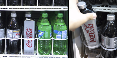
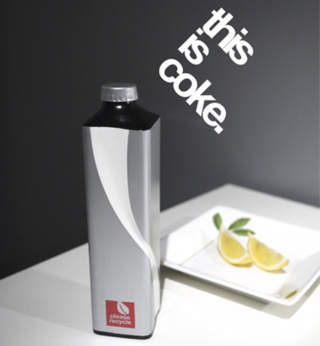
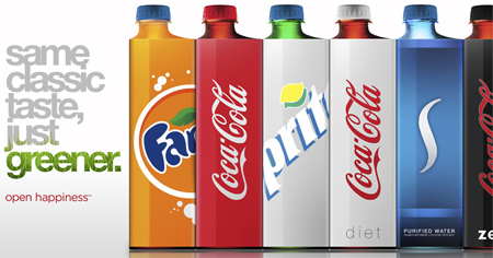
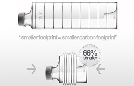
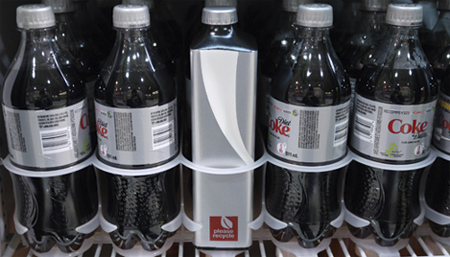
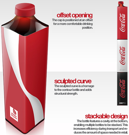
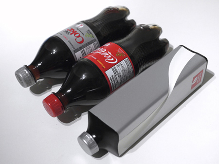
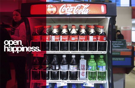
Coca-Cola bottle concept by Andrew Kim takes up less space than traditional round bottles and comes with a cool collapsible design for easy recycling.
As an added bonus, each bottle features an opening at the bottom that allows multiple bottles to be stacked. This increases efficiency during transportation and reduces the amount of space needed for storage.
For more creative designs, check out: Cool and Unusual Packaging



Chris
Great concept, I think more aesthetically pleasing and neater than the old plastic bottle shape.
And a bit more beneficial to the environment too.
Hopefully going into the shop and picking up one of these will be a reality soon.
Mar 31st, 2010
Sachawinter
A collapsed bottle has the same amount of plastic as a bottle that isn’t collapsed. I don’t understand how this bottle leaves a “smaller carbon footprint”..
Mar 31st, 2010
mee
@Sachawinter: this design will consume less space, means, one container will loads more coke, which in turn less transportation cost, less crate, or “smaller carbon footprint”
Mar 31st, 2010
ajayjshah
Very neat and well thought out design concept. Aesthetically more pleasing for me, as my taste are more contemporary. Sustainability is very important, going green is a great.
*Although, the shape of the bottle has somewhat become part of Coca-Cola’s identity including our world’s pop culture. When you see that shape it automatically correlates with the brand. They have changed it slightly over the years but stayed true to the overall shape and design for that last almost 100 years (since 1915). Changing this is huge and may have negative impact.
see image:
https://wikis.nyu.edu/ek6/modernamerica/uploads/AmericanPowerAmpCulturalHegemony.AmericanBusinessAbroad/bottles.jpg
Mar 31st, 2010
EssPea
Square bottle + carbonation/pressure of a coke = sides pop out and it becomes rounded.
Try again.
Mar 31st, 2010
tim
Great concept. Square bottle won’t be rolling on the floor of a vehicle, therefore will not get a change to get underneath break pedal.
Mar 31st, 2010
Youre"Doom"
@EssPea,
If that really happened, don’t you think they would have figured that out? Come on, man.
Mar 31st, 2010
Pete
Interesting, but:
1. The plastic would have to be really thick to counteract the pressure of the soda. I don’t see it staying square, even with the sculpted curve. Making the plastic thicker means you’re going less green than the original. Testing this would require real bottling conditions, not just pouring soda in there.
2. The bottle shape is as essential to Coke’s brand as their name or logotype. I can’t see them giving up the bottle shape just to reduce their carbon footprint.
3. Unless the corners split open, that bottle won’t compact at all. Besides just the shape, the sculpted curve will work against you. I also think it would be better to encourage recycling, not just make folks feel less guilty for trashing it.
4. You now have to line up the bottles when putting them on the shelf or in a cooler. The old way required no thought, just stack them in there. Minor, perhaps, but I imagine this will mess up machines at the least.
5. Looks unfomfortable to hold. The old round shape fits your hand well. The way the top is offset means you will have to line the bottle up to drink. Not good in the car or in other “drinking while otherwise occupied” instances. You don’t want the location of the top to change based on how your hand is twisted.
6. Honestly, it isn’t very attractive. That’s personal prefence, though :)
Mar 31st, 2010
Mr.Rainbowfist
Pretty amazing, they should do this. Or Pepsi should steal it since Coca-cola’s shape is a trademark.
Mar 31st, 2010
Rob
Now we need square cup holders in the car.
Apr 1st, 2010
Critical Eye
@Pete
Great critique. This design doesn’t really work that well.
Apr 1st, 2010
Sky_pirate
@Pete
Your argument is completely one sided.
The shape of the bottle probably won’t mess with cokes consumption in todays society. No matter what shape the bottle is, people will still drink it. And if they don’t like the bottle, get a can. And besides, most relate coke’s can design more than the bottles.
The rectangular design would be easier to package and shelve. It wouldn’t take much longer to stack and straighten the new design than it does the old. Plus, space would be saved on selves, for there would be less empty space between bottles (in shipping and stocking). As for machines, I’m sure it won’t mess with most contraptions, since most just drop the bottle into the hole for you to grab anyway.
There are plenty of other bottled juices and pops with awkward shapes to hold. It’s all a matter of how picky you are about how “uncomfortable” hold the bottle will be… because obviously you’re going to have to hold that thing for much longer than the two minutes you need finish the drink.
I believe the new concept is not necessarily meant to look good, though it doesn’t look bad, it is something different and will generally catch the public’s eye. Not to mention just more promotional hype about a new green design.
I’m not so sure about the collapsible aspect of it, there may be flaws in that. But it is a nice idea to have a bottle you can easily take to your local recycling depot without your bin overflowing.
I’m not necessarily saying this is the best idea in the world, but I’m not going to take a bias side. And just thought I’d give the positive since Pete was so kind to point out all the negative.
Apr 1st, 2010
Loni
HAHA! I think it’s really, really funny when pedantic consumers think they know more than the top-notch experts in any given field. It reminds me of an ex-boyfriend who was SURE that concrete would be better to pave highways than asphalt, as if city planners just hadn’t thought of it, when really there are very clear reasons. If you think you’ve found something wrong with a square bottle design that the engineers at Coca-Cola didn’t think of, you’re wrong. They know more than you do, have more experience than you do, and have (gasp!) actually tested some of this stuff. Seriously.
Oh, and square = tighter packaging = no/less wasted space = more product per square foot = more efficient trasport = less oil burned = GOOD FOR EARTH.
Apr 1st, 2010
lea
i dont think that this would work its a nice idea but coke wont give up there bottle shape i could see it working better for like a new product or a juice. also it is just a concept from some person not from coke or at least thats how i read this so in concepts there are a lot of flaws to work out.
Apr 1st, 2010
ms
@Youre”Doom” amd @Loni: I think both of you expect that this concept is made by Coca Cola and “they can’t be wrong”. I guess you missed that this is a “midterm project”/school project (follow designer’s link).
However, I think it’s an amazing concept and hopefully it will inspire not only us and the folks at Coca Cola. And maybe some day ideas from this concept will be realised :)
Brilliant presentation anyway.
Apr 1st, 2010
superfresh
http://www.sincerelysustainable.com/wp-content/uploads/2009/08/naked-overview.jpg
The square design is not a completely new concept. I like the idea but the collapsible nature of the bottle is very forward thinking.
Apr 1st, 2010
FillT
While there are flaws, I think it is an interesting idea. However, the idea of it being “greener” in relation to the picture is slightly misleading. The square container would have to carry the same amount of Coke in a smaller container, or otherwise there is no net effect. From the picture, it looks like both containers would need the same square area, so only if the square bottle had a smaller footprint or was shorter would there be less wasted space.
Apr 1st, 2010
2LV2
What about just using good old re-cycleable glass?
Apr 1st, 2010
Anja
Idea is great and stuff.
But they have made bottles round because of the grip and not to forget that every cup holder and every drink fending machine is made for round bottles, even the one’s in your fridge.
It would be unlogical to pull that idea throug.
Sorry if I have incorrect spelling or grammar in my piece.
Apr 1st, 2010
Josh
This was posted on digg 3 days ago and this is what one of the diggers had to say about it:
1. It’s a concept by a student, not something from Coke.
2. It won’t work for carbonated drinks because of the pressure. (I’m guessing art student, not engineering)
3. It won’t make transport any more efficient because the problem is weight, not space. Current containers stack just fine etc.
4. Coke is for the most part not shipped around the world in containers, it’s produced locally and moved on trucks that are limited by weight, not size.
5. Glass containers are far more environmentally friendly.
Apr 1st, 2010
Den
Those bottles look cool!
Would we see this on the market? Who knows…
I love this green concept!
Apr 1st, 2010
BGK
That concept it’s good as pouring CocaC. directly in hands of costumers. I think the target is messing…try with fruit juice!
Apr 1st, 2010
ikhwan
wow you guys are pretty good at commenting only seeing the pictures. anyway, nice concept!
Apr 1st, 2010
timmay
@2lv2, i agree why not just make them out of glass in a square shape if plastic wont work.
Apr 1st, 2010
Kristen Nicole
Don’t beat the guy up! He had an idea, he was bold enough to test it to the extent he did, and subsequently share it with the world. Critique constructively. Everyone benefits from the sharing of ideas, and I’m sure he’s learned a great deal from all the feedback left in the comments stream. That’s what it’s for, right?
Apr 1st, 2010
CK
I’m sure there’s a good reason coke doesn’t make it in glass anymore. Probably far more expensive than the plastic.
Plastic is just more convenient. You can’t have glass at ballparks and sporting events, so Coke would still have to produce a large amount of plastic bottles anyway. I really only see glass versions of coke in those novelty small (8 oz?) bottles, and even then, very rarely do I see those.
Plus, glass breaks easily. Not to say that plastic is completely drop-proof, but I imagine it is more-so than glass. If a plastic bottle breaks/cracks, just the soda makes a mess. If a glass bottle breaks, the soda and the glass makes a mess. If you are from an urban area and ever see broken glass on the street, you know this is a valid point. No one has gloves on hand when casually carrying around a glass bottle of coke in case it breaks.
Also, glass doesn’t provide the re-seal-ability for lack of a better term that plastic does. Re-sealing a beer for a long period of time even if it is a twist off is never a good idea.
Apr 1st, 2010
Dan
@ Lori: HAHA! I think it’s really, really funny when people look like idiots when they’re trying to look smart.
I can’t believe you thought this was actually a concept by Coca Cola. You must be pretty dense. And concrete IS better for highways than asphalt. It lasts much longer and needs far less maintenance. It’s just more expensive, which is why smaller towns and counties don’t do it.
Apr 1st, 2010
Karin L.
Very good idea!!!
Apr 1st, 2010
Bruno Peitl
The true design is starting to take it’s place in the world.
Apr 1st, 2010
Marc
A square bottle uses more plastic per volume of coke than a round bottle.
Apr 1st, 2010
Bill
+1 for Josh. Best arguments on here (even though they weren’t necessarily his).
Apr 1st, 2010
netz
@2LV2
agree with you ..
lets really recycle, glass bottles do this
Apr 1st, 2010
anna
COOL!
Apr 1st, 2010
t
@EssPea
Maybe you should work for them then! Since you know everything about it and all…
Apr 1st, 2010
G
it looks like the future!!!
Apr 1st, 2010
Pete
Not sure why the bile.
Folks put their designs out for critique. I’m thrilled that they do that.
– No, this wasn’t from Coke; it was a student project. Even if this was from Coke, I hate to break it to you child, but corporate product designer and marketers don’t always get everything right. (New coke anyone? – or at least for those of you old enough to remember. New pepsi logo anyone?). They often have constraints and pressures that interfere.
– No, not all the ideas were thought through. Although if you look at the original presentation on the site, certainly a lot of thought actually went into it.
– Yes, this is a neat design.
– Yes, it was creative.
– No, it wasn’t professional. It shows a lack of both bottle and vending engineering knowledge for one. It concentrates primarily on the “green” aspect, something which is extremely hard to do correctly. For example, the smallest shape for any given volume is a sphere. Deviate from that and you use more plastic. Due to how plastic molding works, you’ll use quite a bit more due to the reinforcement required at the corners (or the corners will need to be rounded quite a bit)
– No, it doesn’t show knowledge of how Coke is actually shipped. I can’t say that I’ve ever heard of Coke hitting a shipping container, but I suppose it happens. It’s usually shipped as syrup.
– Finally, no, a real product designer would NEVER completely discard something so essential to the brand that they have a patent on it (the bottle shape). You don’t “hint” at something that critical.
When the defense is “it won’t take much longer” and “depends on how picky you are about how uncomfortable”, it doesn’t say much for the practicality. Neat idea, just not practical and doesn’t live up to the mission.
I love seeing new ideas here. Not all of them are winners, though, even if they *are* creative.
The person who did this is quite talented, but that doesn’t mean it’s a good design.
Pedandic? Maybe :)
Apr 1st, 2010
MidlightWest
@Pete
I completely agree.
Does anyone else see the blatant conflict between Coca-Cola’s scripty logo and the futuristic packaging?
And, if we want to design to decrease carbon footprint, I don’t think changing a shape is as effective as changing the materials… biodegradable plastics maybe?
This guy is creative… sure. But, it looks to me like the sort of project you come up with by finding the first thing you see… a Coke bottle… what if… it was square!? We’ve all had one of those projects.
Apr 2nd, 2010
JK III
I like curves.
Apr 3rd, 2010
also
@Loni:
http://www.cement.org/pavements/pv_cp_highways.asp
Apr 5th, 2010
felix
Now I’m just a 15 year old school student so correct me if I am wrong but I see multiple flaws in this design. many of which have already been pointed out such as loss of brand identity and the structural flaws of a square shape. One of which that hasn’t been addressed is the lack of grip it provides. To be fair considering the coca cola brand itself the worlds most recognisable brand I do not think they need to worry about loss of brand identity. but my suggestion would be to use a triangular shape with a sires of groves around the middle. This would keep all the benefits of the square but also add better grip and the cap could still be centred in the middle solving the problem of orientation. The problem of strength would still remain though. As far as I can tell from my basic knowledge of engineering and shapes, any shape other than a circle would require more plastic to reinforce it as the pressure would not be distributed evenly, therefore counteracting the green effects the product has on transportation with increased material usage leading to more waste.
Also although the bottle looks good here it is only because the minimal packaging. In a real world situation it would be far more cluttered with info and would only be a thin band around the centre of the bottle as seen on the current ones.
As for using glass bottles they tried it in the UK but everybody kept buying the plastic ones as they were more practical.
Apr 5th, 2010
Marko
“Voda Voda” bottle has square design for more than 5 years…
http://www.zavodbig.com/2009/05/13/message-in-the-bottle/
Apr 6th, 2010
Person
I like the design and I think it would help people to be greener because of the fact that it can be folded up although I don’t think it looks as good as the round bottle.
Apr 7th, 2010
Engineer
I am a welding engineer not a plastics engineer but i know about statics and strengths of materials. Also a little bit on how plastics work. Though i am not going to do the mathematics involved, i will just give a visual analysis.
From the design the bottle should not have a problem because…A) the corners are rounded and the bottom is so the stress risers will be small. B) the surface area of the flat parts should be enough to distribute the force of the pressure from carbonation which means that it shouldn’t bulge out that much. C) Since the bottle will be “blow molded” the sides and the center panels will have slightly less plastic then the little ridges that cover the bottle, this should increase bending limits so the bottle will be stronger to withstand the forces (though a slight bulge will probably occur it would be small).
That’s about it i am not going to do the math. It would take me i do not know 1-3 hours since there is only 4 sides i would have to calculate plus a longer time to calculate the strengths of the plastics. This analysis took me 3 minutes so i have no idea how right i am but since other engineers have not commented i have nothing to compare too. (there is always at least 3 engineers doing this in a group to compare to one another)
Apr 8th, 2010
Drew designs
Great concept, would love to see it in stores, even if it was just a test run; Beautiful design overall. Glad i’m not in this student’s class.
Apr 8th, 2010
Reilly
It’s a rectangle. It’s nothing “revolutionary”.
Apr 12th, 2010
Another Engineer
@Engineer,
I am a Design Engineer myself, with some FEA and structural experience.
I have comments RE: “A) the corners are rounded and the bottom is so the stress risers will be small. B) the surface area of the flat parts should be enough to distribute the force of the pressure from carbonation which means that it shouldn’t bulge out that much.”
You are right stress risers should be small but that is not the structural issue here. Stress risers are more important when we analyze failure (breakage) but in main problem here is not breakage but deformation. We hope to design the rectangular bottle not only not to break but not even to bulge, so we have to look at deformation, not breakage. So, don’t worry about stress risers.
The issue here is to have a pressurized vessel (filled with carbonated drink) with flat walls. Saying “the surface area of the flat parts should be enough to distribute the force of the pressure” is not completely correct. Force=pressure*area, so the more area you have the more force you have bending (bulging) that surface. You do not “distribute” the force of the pressure. You **add** the force of the pressure on every individual square inch of the surface and that is what causes the wall to bulge. Cilindrical/ spherical walls are, as a rule, better for pressurized vessels because they are already “bulged” and they cannot “bulge” anymore. Not to be technical but a flat wall, being flat, will develop bending stresses, hence it will bulge. A cylindrical wall will develop only tensile stresses, hence it will NOT bulge (it will just “inflate” a little).
To repeat previous comments here and elsewhere, there is some likelihood that bottle plastic weight for the rectangular bottle will have to go up to have a small enough “bulge”, therefore increasing carbon footprint, use of plastics and so forth. Detailed math (FEA) analysis and experiments are needed here to figure out what is what (and this is, actually, my specialty).
Having said that, I want to be first in line to hire Mr. Andrew Kim when he graduates in about 3 years. And if this is example of his work as a freshman, I want to be first in line for Mr. Andrew Kim **TO HIRE ME** in about 7 years. Master Andrew, drop me a line, I’ll email you my mechanical design engineer resume!
Apr 17th, 2010
Matt
What about states that have deposits?
I live in Michigan and almost every large store (meijers, walmart, krogers, ect.) have machines that you deposit your bottles into. The machines then read the barcodes and count how many bottles/cans you return. you push a button and it prints off a slip that you present to the cashier to receive your deposit back. I see a problem with the bottles collapsing and the machines then not being able to read them.
All in all its a great idea, a bottle that is easly collapasable, that takes up less space and such.
Apr 22nd, 2010
Marqie
I don’t think people quite understand that concept artists aren’t exactly experts in the fields of physics or real bottle design.
The shape simply wouldn’t work because of the carbonation pressure. Also, it would be rather uncomfortable to hold.
I could care less about the iconic shape, but I don’t want to be holding a cold rectangle that has bumps all over it.
May 31st, 2010
viki
I think it is a great design. As an artist, I have to say I think it is a cool design. Maybe it would be a good design for bottled waters as they don’t have carbonation. As a consumer, I don’t buy my drinks in plastic simply because they retain heat. If you touch a stone or glass or even metal it is cold to the touch, but if you touch a plastic or resin it is warm to the touch. I personally drink my Coke in cans. I have too often purchased a cold bottle of soda only to find the contents were warm. Yuck.
Dec 12th, 2010
Eric
I think the designer was preoccupied by the idea of making a square bottle and completely failed to realize why bottles are round, not much of an accomplishment for a product design.
Jan 7th, 2011
Gerald
Why not make the square bottle like a lego brick. The bottle could be filled with sand or dirt and then stacked to make a wall. The sand or dirt would serve as insulation. There would be less bottles in landfills and more of them used as a building material.
Feb 7th, 2011
Jon
If your are in any doubt about the ability of the bottle with carbonized drinks check out Blue Marlins design of Isklar carbonated water. Innovation at its best!
Feb 9th, 2011
John
A square bottle will require 13% more plastic to hold the same volume of liquid. And that is not including the additional plastic due to thicker walls required to provide the same structural support. So, the bigger tradeoff here would be more plastic required per bottle. Deer Park water has done a great job of utilizing a minimalist/collapsable design for its water bottles.
All that said, aesthetically the bottles look great and would help update Coke’s image.
Feb 18th, 2011
John
Following the above comment, it would be interesting to study of the tradeoff between the additional plastic required for a square bottle versus the savings and polution reduction due to transportation, storage and logistics that Andrew illustrates so well.
Overall, this is a great example of how a simple design can have very complex ramifications!
Feb 18th, 2011
witlessfool
Here’s what makes sense to me… If the same type and thickness of plastic is used, each bottle of coke takes up more room and uses more plastic: high school math says so. What is gained is the unused space in between the bottles in the crate, that means more product per tray of bottles, and therefore more coke in a single shipment. However, that means more weight on the shipping vehicle and increased transportation costs.
So that would be, fail, fail, and – weight for it – epic fail.
Check out Walmart rubbing alcohol bottles, they are also fishy.
Mar 22nd, 2011
Danger
I’m a blow molded product development engineer / manager, and I skimmed a few of the comments here as I made my way down the list. I know I’m late to the game, but here’s my input:
I like the design overall, but as mentioned, loses the Coke bottle brand identity, and kills the comfort in your hand.
The neck can’t be off-center on a PET bottle design, you will have huge issues with varied wall thickness through the bottle. Thick wall on the side closest to the neck, thin wall on the opposing side away from the neck.
You need a minimum radius in all corners or 1/8″ / 3mm in the bottle body when it comes to PET bottle design. The bigger the better. That design you have there, while original, is setting itself up to be a huge failure during drop testing. Sharp corners are a huge No-No in PET design. Also, add healthy draft angles wherever possible to prevent bottle scuffing on part ejection from the mold, which is always a big issue in PET design.
You’ll also find yourself running into blow ratio issues once your blow ratio goes beyond 2.2:1. Meaning the bottle width or depth really shouldn’t exceed 2.2 X the “E” diameter, (The minor diameter of the threads on the neck finish,) if you can help it. Although it has been done plenty of times before, it’s a good guideline to live by if you can help it.
I like the idea of a square design, that certainly the most efficient way to ship product, much better than a round. But even with healthy design techniques like adding good corner radii to the shape, giving the bottle panels some radius, etc., the processor is again going to be battling varying wall thicknesses here. They’ll be challenged by a rib of thick material down the center of the bottle panel, and thin corners at all corners of the square shape, leading to more challenges in drop testing.
Onto to collapsing the bottle. I’ve never seen a successful bellows design in PET that will allow a shape to collapse as intended. You can do it in HDPE, but the amount of sharpness you would have to apply to the corners of your bellows design to get the plastic to collapse would override the minimum radius you could feasibly blow mold in PET, bringing you back to more thin corners and drop testing failures.
Sorry, like the concept, but it’s a manufacturing nightmare.
Jul 25th, 2011
Adrian
why not try with a bigger head for its top? The cap part can be a bit larger,well, the gas has to go somewhere right?
Oct 5th, 2011
Val Ivey
This is NOT a new concept.. I own a SQUARE Coke bottle
orinally produced In Kenosha, Wis. years ago. It is glass with a rounded top. with the city name actually
molded into the bottom of the bottle
Oct 29th, 2011