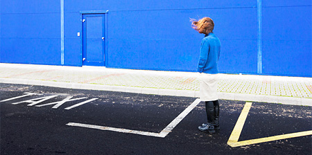
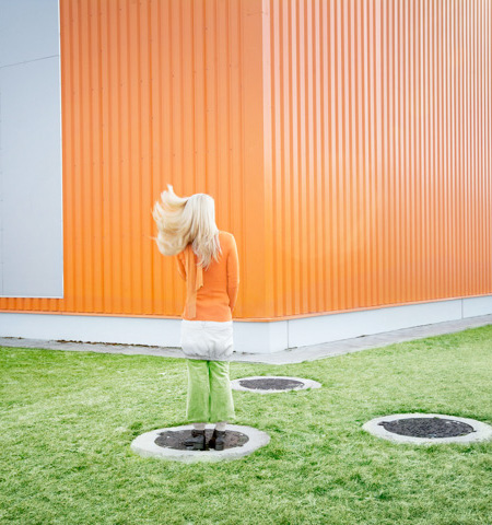
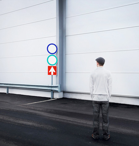
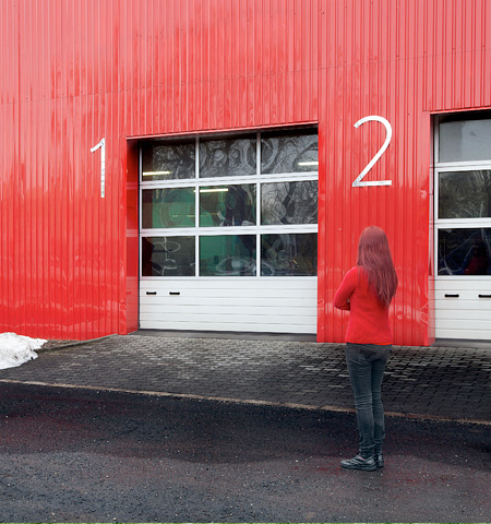
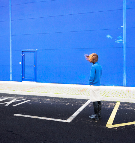
Creative photo series by Bence Bakonyi features people in clothing that helps them perfectly blend into their surroundings.
Selected clothing matches the background and acts as invisibility cloak.
Camouflaged people blend into the environment and disappear.
Also check out: Invisible Man and Camouflage Art by Liu Bolin


jacklyn
meh. I like the other ones where people are painted to look like their background. This is too bland for me. nice try though.
Mar 15th, 2013
Chewie
Agreed with Jacklyn, there have been some designers which use a green suit which reflects the background so the person appears to be hidden by the background and others which actually paint themselves to fit into the scene. This one isn’t too unique nor new? just using perspective and simple color matching, almost like the H&M cloth pattern advert. Its a nice idea but this could be pushed much more, why only one person? but not attempt a crowd or a complex scene?
Mar 16th, 2013
Jürgen
nice creative idea!
Mar 16th, 2013
Michal
@jacklyn, @Chewie – I don’t agree with you guys at all! This is so much more creative than painting yourself to match the background – that one is so overused. Just look at the first picture with the girl in the orange. She is normally dressed (!) and still she looks almost invisible at first glance.
I love this one!
Mar 16th, 2013
Colin
Quite like it myself, bunch of grumps…
Mar 16th, 2013
Gert
I think this is slightly better than the painted people if only because it looks almost accidental in nature.
Mar 16th, 2013
Chewie
@Michal- I hardly doubt painting a human body the same color and background is un-creative compared to this. I’m sure artists and people who paint would agree painting a body to fit into the background is much harder and creative then this. Its just fact if you ever painted a complex scene with a huge range of colours, pain in the ass :p. But I don’t think its over-used, I’ve only seen the main piece by that designer.
Mar 17th, 2013
Douglas
In either style, one step and the illusion is lost. The body painting is far more involved and that chinese dude was the best I’ve seen.
Mar 17th, 2013
Karen
This is just too cool.
Mar 18th, 2013
woops
@ Chewie, Michal, and jaclyn
Level of creativity and skillfulness is a very insignificant point here. The artist has a different means here than simply “blending-in-with-the-background” as some of you indicate. There are very observable aspects of the body seen, with no intent to blend into the background: the hair and skin. The artist has cleverly positioned the body, its colors, and clothing to replicate the background (which happens to be a building, by the way, and not a historical/cultural object or archetype that the paintings signified). On the other hand, if any of these pictures were photoshopped to match hue, perhaps I would discount some of the cleverness.
I agree that this mode is slightly more fresh than the illusion the chinese artist created — Although I enjoy his works, many artists have copied that method, which can be seen in several posts which Toxel presented.
Mar 18th, 2013