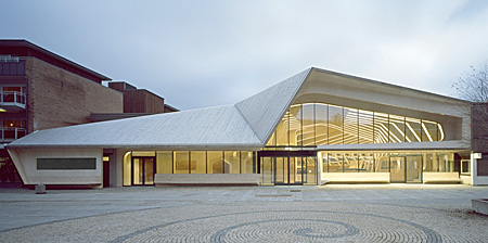
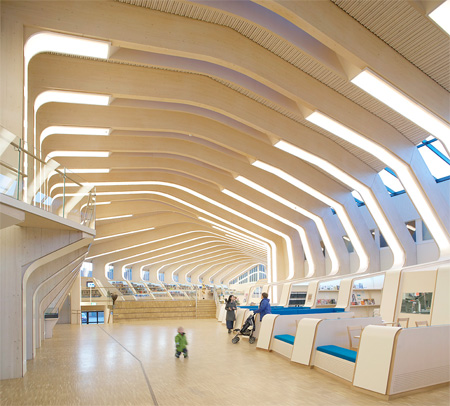
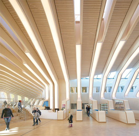
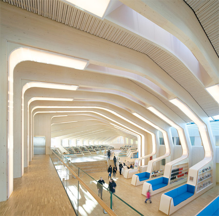
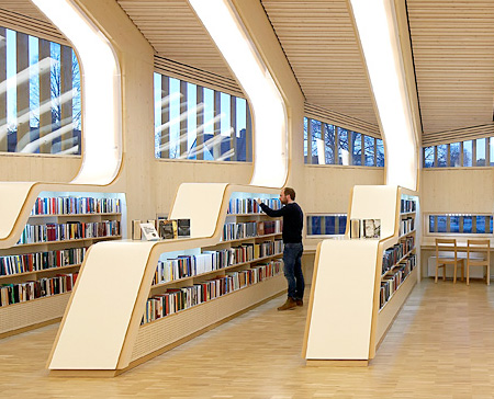
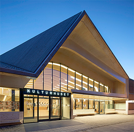
Beautiful public library designed by Helen & Hard architects is located in the downtown of Vennesla, Norway.
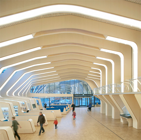
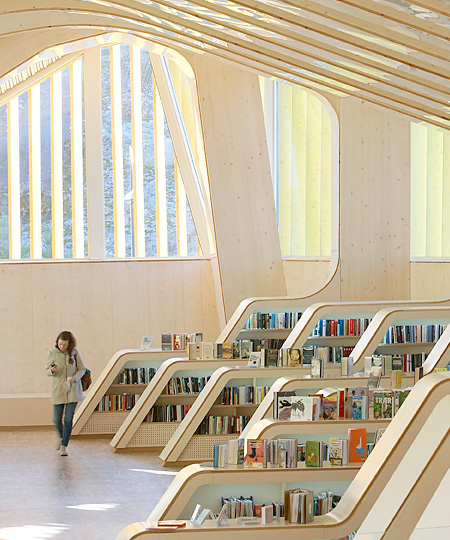
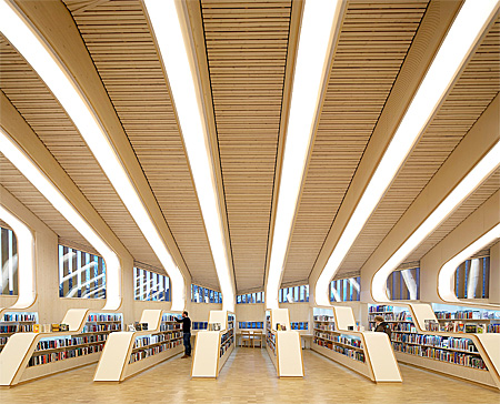
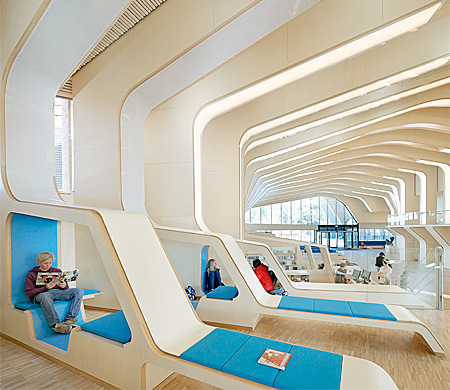
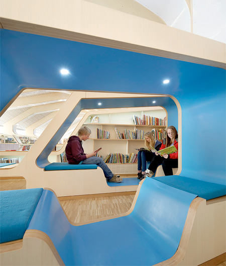
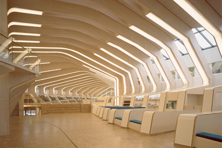
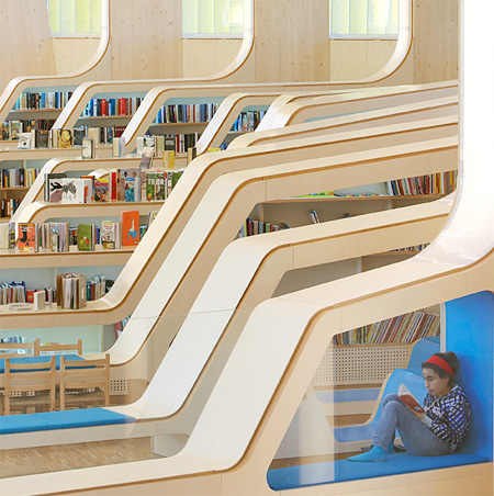
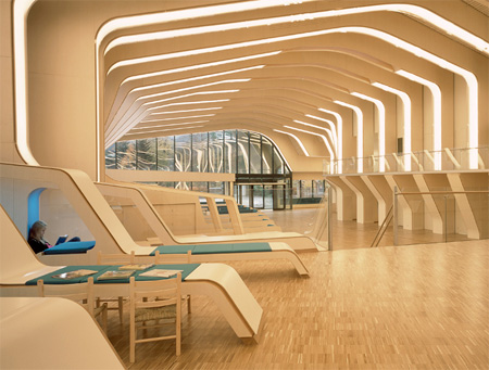
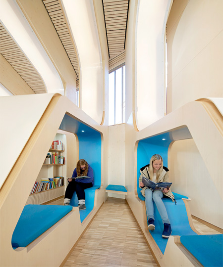
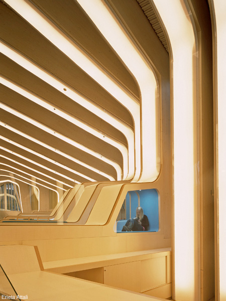
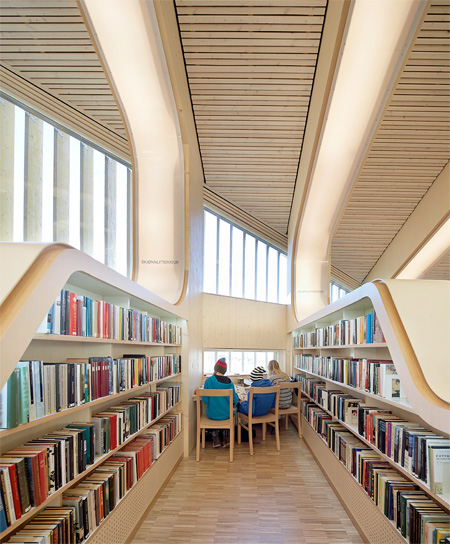
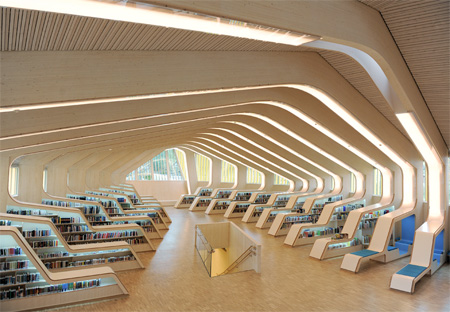
Unique interior of the Vennesla Library and Culture House consists of 27 wooden ribs that form bookshelves and comfortable reading benches.
Large windows let in plenty of light and provide beautiful views.
[photos by Hufton+Crow and Erieta Attali]
Also check out: Bookstore in a Church and Kid’s Bookstore



the prince
Like a piece of heaven in my eyes…
Dec 4th, 2012
cole
Incredible building and library – I know plenty of libraries that could use some modern updating :)
Dec 4th, 2012
Pavel
Interesting look at the division of space
Dec 4th, 2012
jimbo
Wow, I could live and die in this library. It’s so light and fresh looking.
Dec 4th, 2012
Gert
Looks like a space port. Interesting.
Dec 4th, 2012
K
I could live there.
Dec 4th, 2012
ibrahim mert
somebody dreams, somebody make it real!!! is it realy real? someone must kick me, i want to wake from this dream…
Dec 4th, 2012
Nisa Zul
would love to go & bring my lil’ sis there. she will love it so much!
Dec 4th, 2012
Douglas
From the outside it looks like a supermarket, inside like an airport terminal.
Dec 4th, 2012
Max
I like it but it looks too monotonous, almost like a stasis chamber for books… then again that’s a library
Dec 4th, 2012
Niyari
Classic looking libraries are very enchanting, but it would be cool to incorporate a comfortable environment to it such as the seating here.
Dec 4th, 2012
Banaan
This is the most disturbing space that i have seen in a while. it looks like an airport or railway station whit moving staircases popping up everywhere and the reading benches look like solarium’s. They shouldn’t have designed it as a library.
Dec 4th, 2012
Dave
Looks like echoing would be a problem.
Open space is great, but sacrifices shelf space and potentially more books.
There are a lot of children pictured, is this a children’s library?
How does the lower level(s) look?
Dec 4th, 2012
Tansel
@Banaan, I could not have agreed with you more. The airport thing also went through my mind and the whole setting suggests people living in a very fast world. The clustered bookshelves are reminiscent of bookstores found in many shopping malls. I can’t imagine myself relaxed and being immersed in any deep reading in such a place. They should have worked out the library concept in the likeness of a grove.
Dec 5th, 2012
Max
To my the library feels more like a church than an airport, a bastion for the written word as some sorts. It’s clear the architects tried to re-invent the concept of a library, if they have succeeded only time will tell. Regardless libraries in general are doing really bad throughout Europe so new things have to be tried. They don’t draw in enough visitors and a lot of them are closing down because a combination of a lack of income and a lack of need.
For a different perspective just look at the concept of the library in Maastricht that was on toxel a few months ago http://www.toxel.com/inspiration/2012/08/02/bookstore-in-a-church/
Is that your idea of how a library should be? A place that only looks like a library but is actually a tourist location in disguise with an expensive restaurant to match it?
Dec 5th, 2012
Vennesla
This is from my home village – and it is just so amazing in the real as on the pictures – really love this library! <3
Dec 6th, 2012
nidia
that’s bloody fantastic
Dec 12th, 2012
anne tran
it is cool. I want this library in my country
Mar 21st, 2015