
Series of clever illustrations shows the differences between copywriters and art directors.
An ongoing “CW versus AD” project was created by Caio Pena, Henrique Parada, and Letícia Hanower.
The Machine
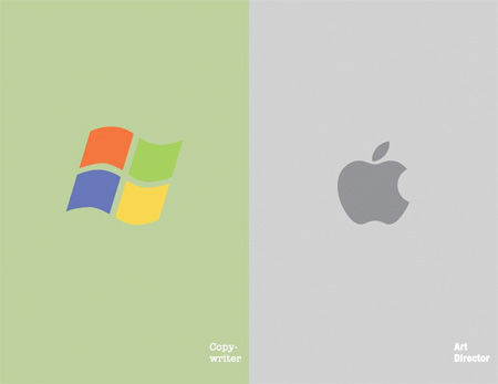
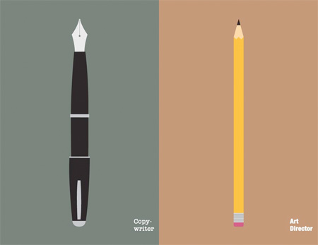
The Tool
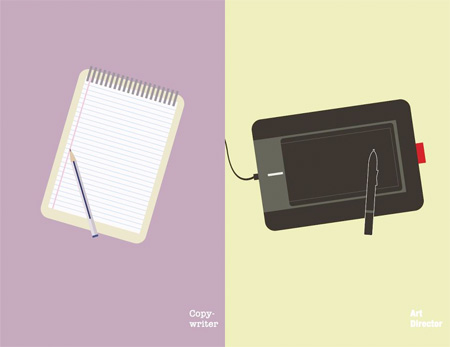
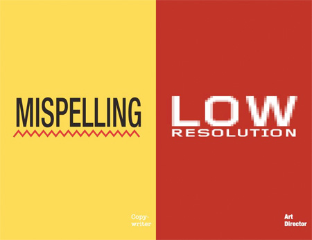
The Software
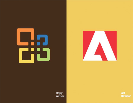
Starting from Scratch
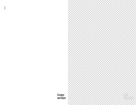
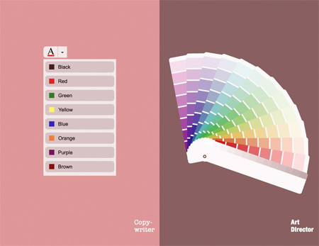
The Colors
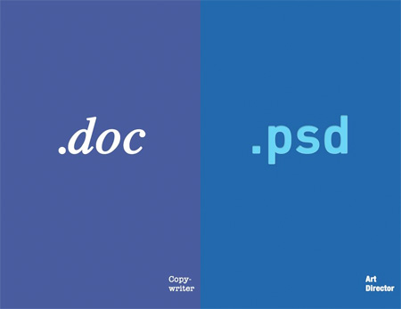
The File
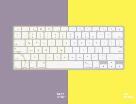
The Keyboard
The Dream Job
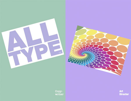
The Reason for Anger
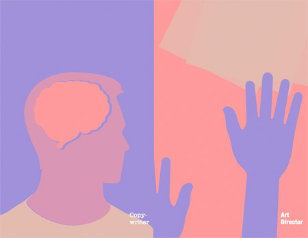
Main Body Part
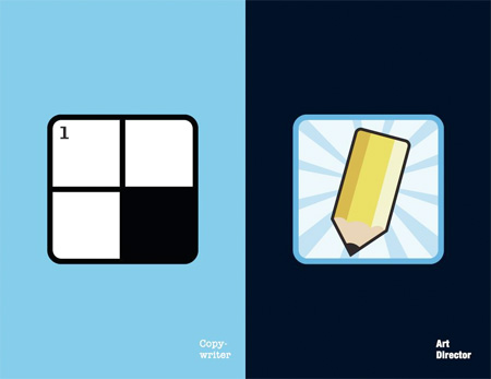
The App
History
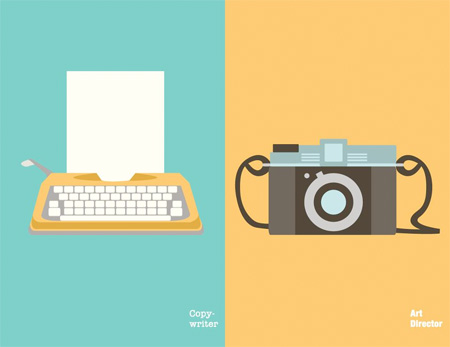
Workday
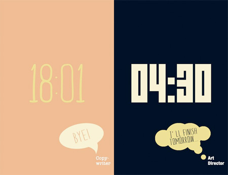
Reading Time
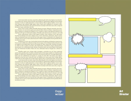
Entertainment
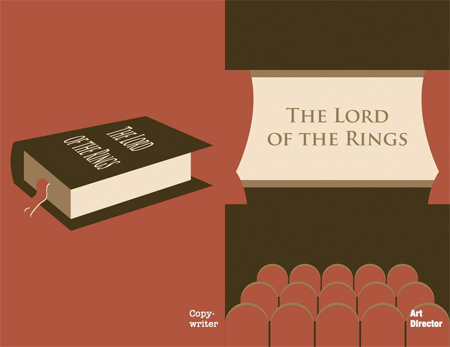
The Dream Pet
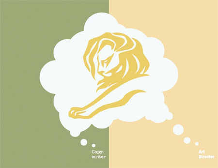
The Brush
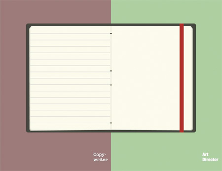
The Moleskine
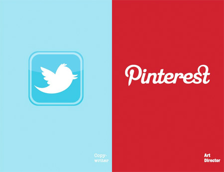
The Social Network
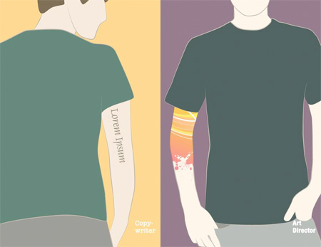
The Tattoo
Also check out: Want vs Need and Words as Images



Alan
Don’t like what this series of illustrations implies. It denigrates the power of expression through words. As if words simply aren’t enough for society anymore. As if you must have colors and pictures and all kinds of lively interactive multimedia to communicate effectively.
Hmm, are we so illiterate that we have no imaginations of our own? Are we so illiterate that we can only absorb information if it’s spoonfed to us with pretty colors? And those who are capable of appreciating meaning through language are suddenly unsophisticated nerds?
Nov 28th, 2012
Floyd
Wow, touched a nerve.
Nov 28th, 2012
Patrick
Whoa, chill out buddy. It’s art.
Also, not once did any of these illustrations claim that either occupation is “better” than the other. It’s just a cute look at two different personality types.
Nov 28th, 2012
kadal
@patrick : i agree with you
it’s not about who’s the nerdiest or coolest or better. it’s just their behaviour image in different aspect. and their behaviour was do the opposite each other, thats what the artist trying to show.
Nov 29th, 2012
Nisa Zul
art is amazing… it tells different stories by using one picture.
Nov 29th, 2012
Fillibert
@Alan uses a PC
Nov 29th, 2012
Debbie Downer (woops' sister)
I don’t get the “dream pet” one.
Also, the main body part is conflicting.
Nov 29th, 2012
Adrian
I’m not a copywriter, nor an art director…but I’m both of these things depicted in the series.
I disagree with a lot of the images a bit just like Alan. I also think that the person that created these really doesn’t know much about either profession.
Nov 29th, 2012
Trav
love it.
why would you bother to look further than face value on this? just uses simple stereotypes to make a point…in most cases, i reckon they’re true.
Nov 29th, 2012
erica
made me smile on this cold morning.
I’ve worked as both and swapped roles as needed and yes, the two roles make you think differently, but this is just light touch and yes, face value as Trav says.
Nov 29th, 2012
itai
Anytime you try to make people into stereotypes it’s annoying.
Nov 29th, 2012
Max
Shoving people into boxes, gotta love it.
Nov 29th, 2012
Patrick2
It didn’t shove anyone into boxes, it looked at the people already in those boxes and conveyed the perceived differences.
Nov 29th, 2012
Patrick2
By the way:
1. Stereotypes can be generalizations
2. Generalizations are made when a majority of things behave in a certain pattern (not the time).
3. and yes, generalizations can be true.
Stereotypes and generalizations are neither right, nor wrong – they only express things that are true more than half the time.
@ itai – stereotypes are not judgment calls, they are patterns that exist, whether you choose to be ignorant of them or not, and whether you LIKE them or not.
Nov 29th, 2012
brann
I agree that the one with the main body part isn’t correct, thinking is a shared trait in these professions.
Also, I don’t believe that copyrighters are denigrated in any way by this illustration. If anything, I felt the art directors kind of seem shallow people. It’s all relative, depending on what you think is valuable and interesting.
Nov 29th, 2012
GoW
These were created by two Art Directors and a Copywriter, so I think they have a pretty good idea of what the roles entail, at least in their own circumstances. There’s some stereotyping, but this is people stereotyping themselves, so there is no malice or naivety about it.
I don’t think there is any suggestion of superiority between the two, and they certainly aren’t derogatory towards Copywriters – in fact, I think they’re make the role seem rather appealing.
Maybe you should all visit the FB page and read more about it before jumping to such strong conclusions: http://www.facebook.com/cwversusad/info
Nov 29th, 2012
E
Pretty much described the difference. I think the main body part implies on the major part of body that CW and AD uses the most on their field. Though if it can be corrected, CW uses fingers as much as AD uses brain too…
Nov 29th, 2012
nerd
@Alan uses a PC!
SOO TRUE HAAHHAHAHA
Nov 29th, 2012
Pompom
Everything in the right column: check. Clearly I have the wrong job.
Nov 29th, 2012
Raven Smite
I don’t understand this whole “CW vs AD” thing… but why did the keyboard have a coffee stain in the lower right corner of it?
Nov 29th, 2012
Vinz Clortho
Let’s do one with scientist and creationist. Some fun!!
Nov 29th, 2012
Libeerian
@RavenSmite, you must be an AD because that coffee stain was in the lower LEFT corner of the keyboard, dear.
Nov 29th, 2012
Stefano
Patrick2,
I appreciate what you wrote. Your thought is clear and precise.
Nov 29th, 2012
Kobe
I like this. Im for sure the visual arts side of this but i can still spell a mean sentence.
Nov 29th, 2012
Giz
Why are people so easily angered, this is a funny representation.
Nov 29th, 2012
Stu
@Libererian – Don’t think so. A (good) art director’s left hand lives over command/opt/shift so the coffee stain would never be there.
@Debbie Downer – i think the dream pet is a Cannes Gold Lion. It’s a reference to the awards right?
Nov 29th, 2012
Stu
(@Libeerian – unless you were referring to his bad eye for detail. In which case this should be CW vs AD vs Sub).
Nov 29th, 2012
Joe
Lorem Ipsum tat is brilliant!
Nov 29th, 2012
Me
Yay! Arguments!
Nov 30th, 2012
Mangkum
W.O.W!
Nov 30th, 2012
Max
@Patrick2
Stereotypes are anything but ‘patterns that excist’, they are oversimplified ideas and assumptions held by the majority of people.
Generalizations are made based on specific cases (in this case art directors and copy writers that you “know”) which you in turn identify and classify the other people with the same professions with. Generalizations might be true for the people you come in contact with but most likely won’t be true for someone else and the groups of people they come in contact with. Just looking at the comment section of this project proves it.
Nov 30th, 2012
Rob
I have worked in both roles, a graphic designer and a proofer, for a major weekly magazine. I think they are pretty spot on. I don’t see anything derogatory about either of them. I see maybe 3 that are generalizations(Reading Time, Entertainment and Tattoo). The others are merely the tools of the trade.
Nov 30th, 2012
Anna
I think it there are a lot of people angry because of the illustration with the apple and windows sign. Putting them in this diagram makes it look like its a race of who is te coolest: apple or windows… i personally am a bit between both of sides but i prefer windows. It is because of this that i decided to comment on this because it does seem a bit as if the artist wanted to imply that apple is more entertaining and thus better than windows. However, I think that we should just look past the apple/windows part. If you ignore this than it is a pretty impressive piece of art.
Well done! :)
Dec 3rd, 2012
Anna
also… about the coffe stain… that was indeed a bit of a mistake made by the artis because it is generally known that left handed people are more likely to choose a creative profession. So i guess the illustrations should have been switched placing the art director on the left and the copywriters ont he right.
Also it makes it look like copywriters and such are more messy than art directors while (as far as i know) creative people often have more problems organizing their belongings and such…
Dec 3rd, 2012
chris
Alan, chill out dude. We’re all on the same team here ;)
Dec 4th, 2012
Mike
Most authentic copywriters I know hate Windows as much as art directors. We’re typically Mac people, too, for the record.
Apr 11th, 2013
Forditas
Being closer to a copywriter, I feel a bit offended, so I would say it is would appeal to everyone but copywriters and art directors…
Jan 20th, 2015