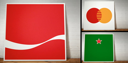
Series of paintings by Dorothy features logos of popular companies stripped down to their basic graphic forms.
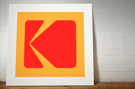
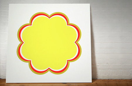
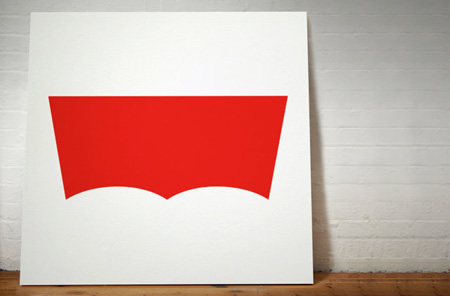
“You Took My Name” art project aims to prove that famous logos without typography are artworks in their own right. Can you identify all the logos?
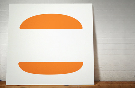
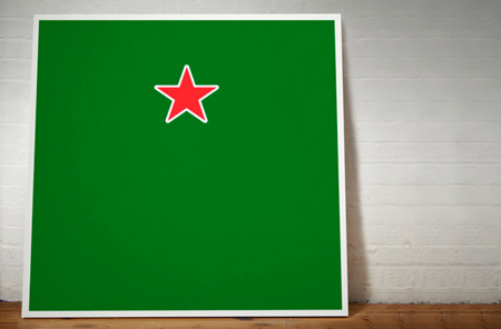
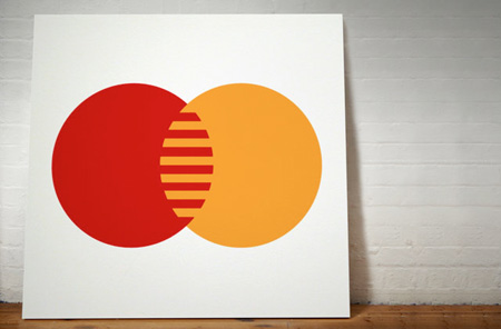
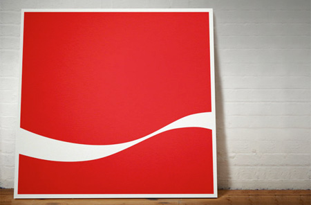
For more inspiration, check out: 24 Cool Logos with Hidden Symbols





Molly
I cannot, for the life of me, figure out the second one.
Apr 19th, 2011
Stephan
@ Molly – Chupa Chup
Apr 19th, 2011
Yen
1 – Kodak
2 – Chupa Chups
3 – Levis
4 – Burger king
5 – Heineken
6 – Master card
7 – Coca cola
Apr 19th, 2011
KKL
Molly: 2nd one is chupa chups
Apr 19th, 2011
Shirley
that amused me for 30 seconds =]
Apr 20th, 2011
Lee
@Molly
2nd one is chupa chups
Apr 20th, 2011
c
can’t say i’ve ever had a chupa chup
Apr 20th, 2011
perv
dali designed the current chupa chups logo
Apr 20th, 2011
PauL B
Hey Molly, not sure if you noticed..2nd ine is chupa chup..ha ha chops!
This is really cool and pretty inovative, wouldn’t be suprised if this is the way logo will head..
Apr 20th, 2011
Levi Kodak
@Molly, think the second one is Shell… Not sure about any of the others though.
Apr 20th, 2011
JJ
@Molly it’s chupa chup :) lollies…mmm mmm
Apr 20th, 2011
Midet
Haha, this is great :)
Also, upon reading the word ‘Chupa chup’ so many times I realise what a weird name it is xD
Apr 20th, 2011
OL
Don’t know if anyone noticed it but. If you can’t guess the brand, it shows it’s name when you rest your cursor on the picture.
Apr 20th, 2011
Steve
I kind of want Coca Cola to embrace that logo now, looks great and contemporary! Yes yes, the inventor spent 6 months designing it but still….
Anyways, why is Chupa Chups being mentioned with iconic brands I think is the more important question?
Apr 20th, 2011
Mapache
Both kodak and master card look a little bit antiquated. They need more than simplification to get in the 21st century. Coca cola in the other hand looks tremendously avant garde.
Yeah, I don’t get the chupa chups either. Even if that’s a Dali design, I couldn’t identify it until I read the comments.
Apr 20th, 2011
Corey
These are simply logos, words removed. I don’t see the intricacy behind removing a word. Yes, they’re beautiful, but difficult to conceive, hardly. Try something a little harder that involves more creativity/manipulation! Those are the companies that could benefit most.
Apr 20th, 2011
Raads
@ OL, lol, that was a kinda fail wasnt it? :P
Apr 30th, 2011
flottenheimer
This is just like when Nike use the swoosh alone.
Which is super nice.
May 27th, 2011