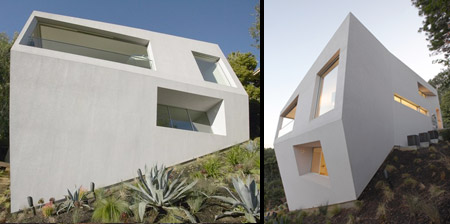
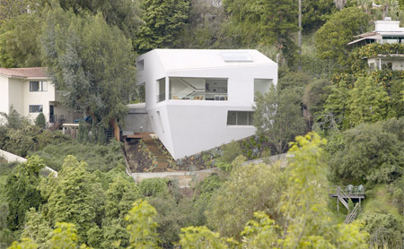
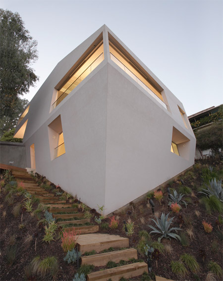
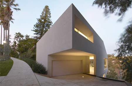
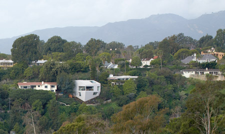
Unique house, designed by Johnston Marklee back in 2004, is located on a beautiful hillside in the Pacific Palisades district of Los Angeles.
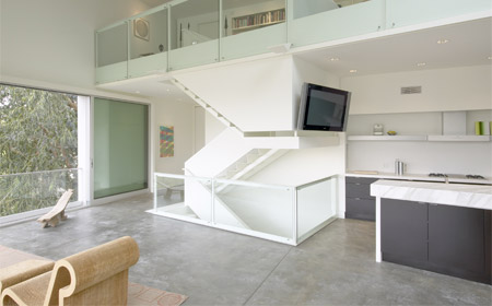
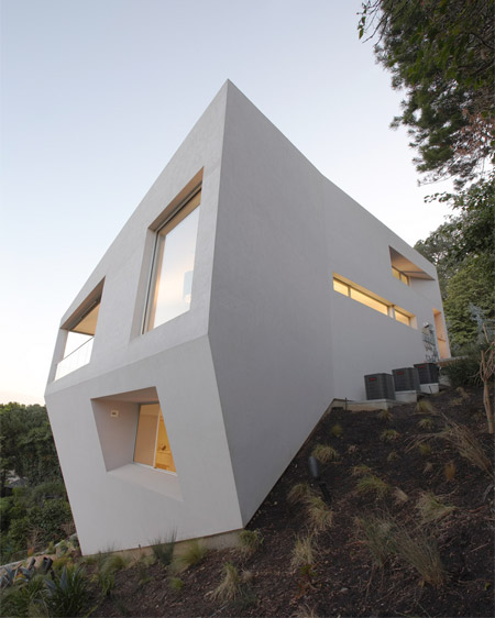
Creative shape of the building helped maximize the volume permitted by the zoning code and provides stunning views from the windows.
Also check out: 15 Unusual and Creative Buildings





Pete
Interesting design. I’m not much on the stark modern look, but the execution here is flawless.
Surprised that modestly sized house takes three air conditioners, but I guess it *is* LA :)
Actually, it’s 3300 square feet according to the article. These photos certainly make it look smaller than that. Definitely check the source for lots of other interesting photos.
Aug 22nd, 2010
Zunny
Ugghh Looks extremely sterile, hard & I am sure noisy.
No warmth, no character, no soul- beware architects armed with only a straightedge.
Aug 23rd, 2010
priyanka
love to live here….:)
Aug 23rd, 2010
Fillibert
ARRRGGGGGGG!!!! Architects hate window cleaners. Only way to wash them is to rappel down. But guess what, white walls means super easy to scuff them. White walls also become gray walls from dirt and pollution. Can’t believe they don’t think of simple things like that
Aug 23rd, 2010
Raads
LOL @ Fillibert
Aug 23rd, 2010
Kirvi_Inci
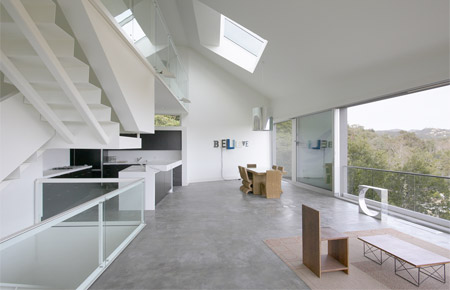
The inside is nice, but the outside is rather unappealing. Then again, I like my houses with some color and character.
Aug 23rd, 2010
Zino
Love the house, very clever design… but the color is WRONG. As noted above, it looks sterile, heartless, soulless, etc.
I’d recommend a warm desert sand color, taken from the landscape, so it might look a bit more organic.
Aug 23rd, 2010
lea
The house is only white because its is not currently being lived in if you owned the house you can paint it. Almost all houses when they are first built are white. Every time this site buts up a house its white stop complaining about the color and look past that at the design this house would be super cool and when who ever moves in it will have it will have a soul, heart and not be sterile.
Aug 23rd, 2010
Zino
@lea… since when is color not a design consideration?
Aug 23rd, 2010
Karin L.
Beautiful!!!
Aug 23rd, 2010
Dysthe
A nice beige color would’ve been warmer and matched those beautiful steps. Green would’ve blended with the trees. A gray would’ve been less grating and more modern (but wouldn’t have blended in with the surrounding neighborhood).
The white’s cheap and will age the house rapidly.
Aug 23rd, 2010
James Ward
In the last shot, it looks like the head of George Jetson’s robot ‘Rosie’ got lopped off and stuck on a hill – Probably when she went to turn off Astro’s crazy doggie treadmill. OK…if your under 30 you probably don’t know what the heck I am talking about.
Aug 23rd, 2010
Kirvi_Inci
@James Ward: I see wat you mean! lol
“OK…if your under 30 you probably don’t know what the heck I am talking about.”
Actually we would! Don’t forget they came out with Jetson’s movie in the late 80’s, early 90’s. Back then they actually showed good entertainment on TV. :D
Aug 24th, 2010
jules
it looks like a face…which totally ruins all seriousness of the architecture :)
Aug 24th, 2010
vlad
It’s actually very interesting, from the first look i though it was upside down house.
I don’t agree with people who say “oh it’s so sterile, soul-less and boring.” For me it has a very bold and clear statement “own not more than you need,” and this house speaks minimalism very well. I admire such bold work.
Aug 25th, 2010
d0rn
The point of the house being white is to comliment and enhance the beauty of it’s natrual context.
Aug 25th, 2010