Collection of the most unusual and memorable advertising campaigns that cleverly promote hair care products.
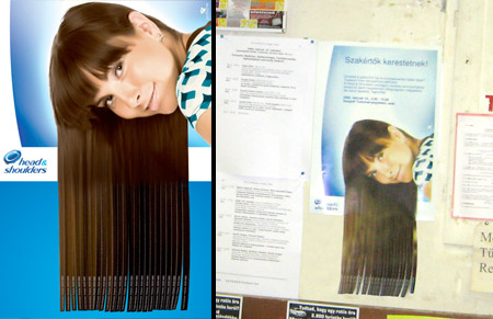
Head & Shoulders Tear-Off Ads
Creative tear-off posters were placed on bulletin boards of the Szeged University of Science in Budapest, Hungary.
Koleston Billboard
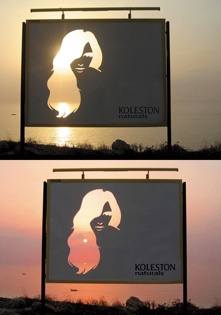
The woman’s hair was die-cut in the billboard to capture the variations of Koleston colors through the view of the sea and skyline behind it.
Pantene Salt Shaker
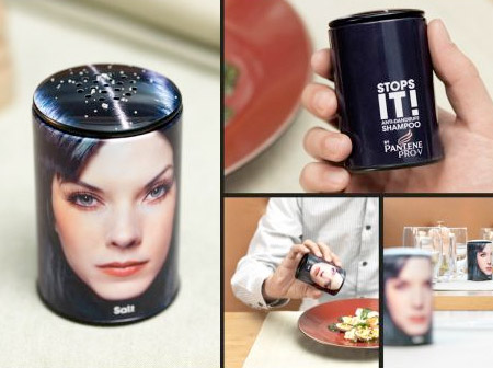
These clever salt shakers were placed in restaurants to advertise Pantene Pro-V anti-dandruff shampoo in Germany.
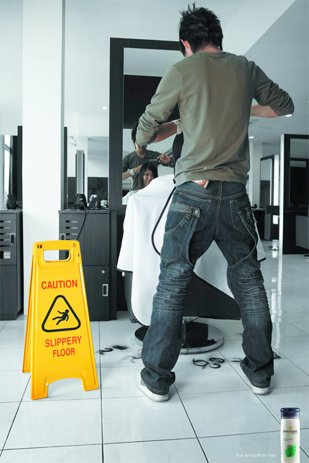
Pantene Smooth Hair
Slippery floor sign warns people that with Pantene, your hair could be so smooth, someone might accidentally slip if they step on it.
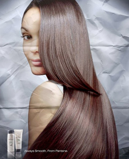
Pantene 3D Poster
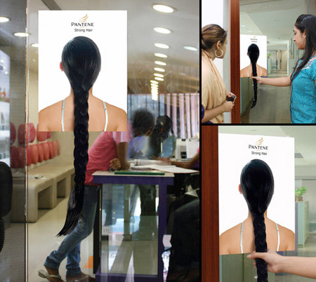
Pantene Door Handle
Each time the customer pulled the hair handle, the core benefit of Pantene shampoo was demonstrated.
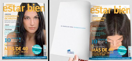
Head & Shoulders Magazine Cover
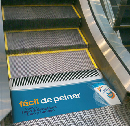
Head & Shoulders Escalator Comb
Creative sticker turned the end of an escalator into a hair comb.
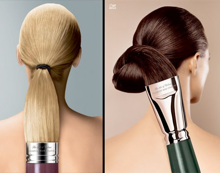
Koleston Brush
Clever print ads designed to promote Koleston hair coloring products.
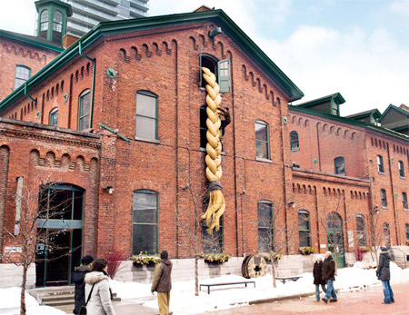
Pantene Building Advertisement
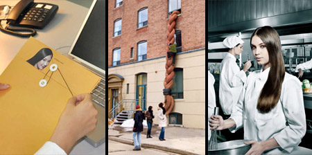
To demonstrate the benefits of Pantene shampoo, professional climbers climbed a giant ponytail attached to a building in Toronto.
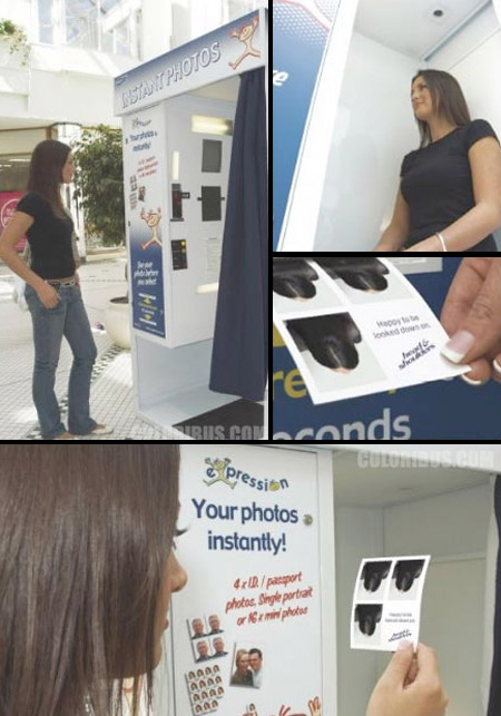
Head & Shoulders Photo Booth
Photo booth was setup to photograph and print out a bird’s-eye view of the customer’s head.
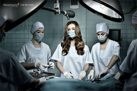
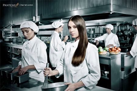
Pantene Hair Fall Control
Clever print ads promote Pantene Pro V hair fall control shampoo.
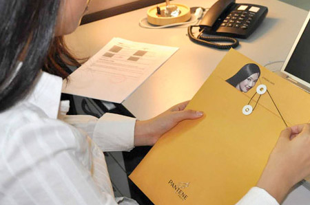
Pantene Envelope
Creative envelopes were designed to reinforce Pantene’s strong hair equity and create buzz around the brand.
For more unforgettable ads, check out: 20 Brilliant Advertising Ideas

James Anzalone
The idea of shaking someone’s dandruff into my food is really really awful. Even if it is just a reference.
Jul 5th, 2010
Kyle
I do it to other people food all the time. . .
Jul 6th, 2010
andrew
I agree that dandruff one is terrible. how did nobody stop that before it got to fruition? big oversight that it would completely gross people out!
Jul 6th, 2010
Toyama
The idea of the dandruff salt shaker may be gross/disgusting but you’ve got to admit, it IS creative.
Definitely not suitable on dinner tables but it sure is suitable as a photo-piece for, lets say a magazine regarding hair-care
Jul 6th, 2010
James Anzalone
@Toyama Yes, its certainly creative and interesting.. I was just speaking about how that design is going to function on tables.
..I just imagined a full kitchen stocked with things like Mayo bottled labeled “puss” and Lemon Juice labled “Urine sample” etc etc… awful!!!!
Jul 6th, 2010
Patrick
Of course, if the dandruff salt shaker is real, the salt shaker should be empty, to show that with their product you won’t have dandruff
Jul 6th, 2010
JK III
How about the photo booth? That would make people mad.
Jul 6th, 2010
Jaqi Mugo
I like the paintbrush one and the hair control
Jul 6th, 2010
Xander
I want that guy’s pants.
Jul 6th, 2010
Raads
lol @ Xander :D they r cool arent they
Jul 8th, 2010
Jason
Dandruff salt shaker is nasty.
Jul 8th, 2010
Bridgette
the salt shaker was just creepy in my opinion.
Mar 10th, 2011
Aubree(:
hahaha these are cool looking but my fave is the pantene (bad speller) building XD
May 15th, 2012
Ches
I thought they were all great. Very creative.
Don’t be silly Toyama and James. They won’t be used in real kitchens. The idea is a marketing idea. The advert made you look at it twice. It has done its job.
Jul 19th, 2013