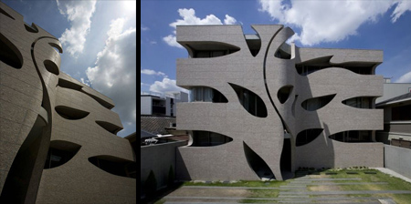
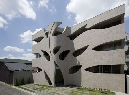
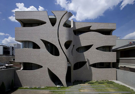
This beautiful nature inspired apartment building, designed by EASTERN Design Office, is located in Kyoto, Japan.
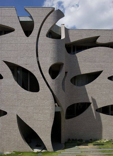
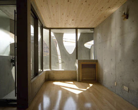
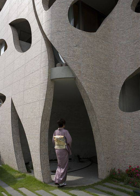
The outside of the Villa Saitan building is covered with leaf shaped holes that let in light and add character to the structure.
Also check out: 15 Unusual and Creative Buildings




Pete
That’s really neat, but it’s misleading to say the leaf-shaped holes let in light. More like all the additional concrete block (more than other builds) block more light than most buildings.
Still, very attractive.
Apr 25th, 2010
Aoki-chan
Wow..it’s awesome!
Apr 25th, 2010
izza
i would write: “less light” than “let in light”
Apr 25th, 2010
vns
I’d say I instead of i. ;)
Apr 25th, 2010
Den
Maybe not superb, but it’s always nice to see people get inspired by nature, daring to break rules, the result is always controversial!
Apr 26th, 2010
fmh
I’m not a fan. In fact, with that grey brickwork and unusual design, it very much reminds me of something I’d find in a project. The barren landscape around it seems to lend support to that image.
Apr 26th, 2010
Zino
Looks like a stylized prison. There’s nothing green about this structure except the purely graphic window shapes. In fact it looks grim and kind of ominous, like there will be bad things happening here.
Nothing wrong with straight lines, this seems to be a napkin sketch that gout out of control.
Apr 26th, 2010
Toasty O's
Work = Cubicle = Cube = Straight Lines = Prison
The amount of sunlight let in aside, it looks fantastic.
It seems like we allow grand buildings, museums and the like, to look nice and be well designed, but continue to live in the same cape and ranch style boxes that we have for decades now. Why is that?
Apr 26th, 2010
Karin L.
Doesn’t turn my crank.
Apr 26th, 2010
Jae Xavier
I’m not an architecture expert, but why does it have it be grey?
Grey grey grey grey. I at a satellite picture of Los Angeles and New York… and all I see is gray.
Can’t they use colored concrete?
Apr 26th, 2010
Charlotte
More so than a prison, I think it looks like a multi-storey carpark.
I’m all for experimentation in architecture, but this isn’t doing it for me.
Apr 27th, 2010
kryptic
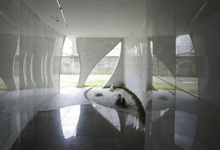
Awesome place !!! but good from inside than outside.
May 1st, 2010
AnnaTrouble
Simply fugly, grey, depressing, and the additional concrete blocks the light from getting inside.
I cannot image how anyone could say this monstrosity is beautiful. I live in Japan, and there are plenty of ugly buildings here, this is just one example.
May 2nd, 2010
kawazo
I am a Japanese and I think this work is nothing more than a bad joke. It at least could be called as a challenge(even if i never know what they are challenging for), but I do not find any beauty here. The photo with lady wearing kimono, indeed is a sick joke.
May 6th, 2010
Domenic Manganelli
This structure in a light wood or anything other than drab concrete would look much better. Maybe even one of those translucent wrap matterials like allianz stadium
May 6th, 2010
Alex
It’s interesting because it’s so unique. I’ve never seen anything like it. It looks better when you’re inside than when you’re looking at the building itself. Just not sure how much I like the window obstructions.
May 7th, 2010
Dietrich
@pete
Very True, they should have used rigid frames and translucent materials for the exterior
Jun 5th, 2010