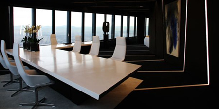
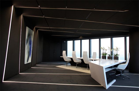
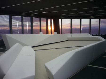
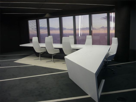
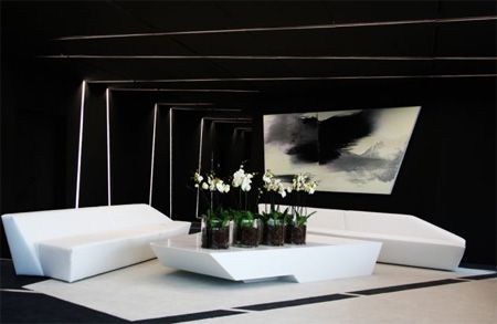
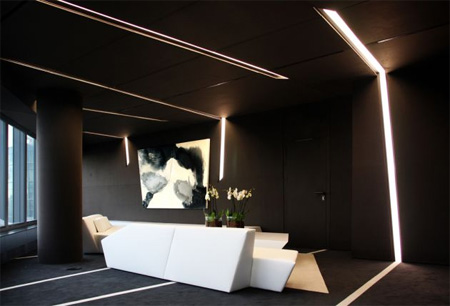
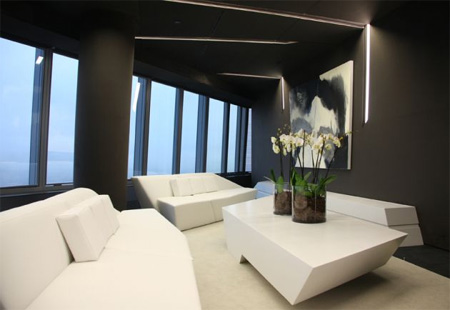
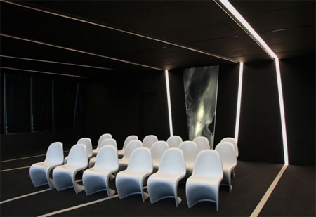
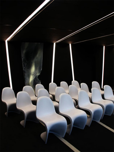
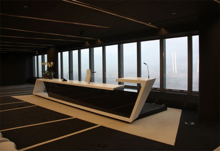
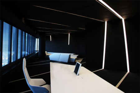
This beautiful futuristic office interior was designed by A-cero Studio for the Torre de Cristal (Crystal Tower) building in Madrid, Spain.
The emphasis was on dark tones: Grey walls and roof were combined with black-and-white furniture to create this clean professional look.
For more office designs, check out: Unusual and Creative Offices




latincrow
cool office, anyone else thinks it looks a lot like the one from the movie “duplicity” but in different colors?
Jan 4th, 2010
unDave™
I won’t use the word “futuristic” for this one…. it’s… omg…
Looks good tho’
-by unDave™
Jan 4th, 2010
Megan
Beautiful furniture, looks like something straight from a movie. Love the chairs!
Jan 4th, 2010
Blaine
bad guy hideout
Jan 5th, 2010
bunny
Feels kind of oppressive for an office environment.
Love the design, but the darkness is a little much.
Jan 5th, 2010
Cwmill
agreed. does feel a little dark. perfect for hatching plans to take over the world.
Jan 5th, 2010
Rani
@Megan
I don’t know about the desk chairs but the one’s placed in a grid are “panton chairs”. Designed by Verner Panton.
Jan 5th, 2010
Kolin
wouldn’t look out of place in the Burj Dubai, expensive and pointless.
Jan 5th, 2010
Kate
It is easy to lose the reality in this interior, :-) everything is too curvilinear. I think, i’ll fill sick in this office.
Jan 5th, 2010
Final
too dark
Jan 5th, 2010
Eric
I would not feel comfortable working in these spaces.
Jan 5th, 2010
mr_biz
lol @ final
Jan 5th, 2010
chuckiesd
It really futuristic. Not only futuristic but it cool and elegant.
Jan 5th, 2010
Julianna Mahley
It looks very “neat” but it will be a mess with people and papers strewn about.
Jan 5th, 2010
Jamface
Psh, different people have different likings I guess. I like the darkness of it. It’s not TOO dark. If you look at the pictures closer, it’s kind of calming.
Jan 5th, 2010
Virginia
Too, too dark and depressing to spend a lot ot time there. Any business setting up there would surely find it hard to hire taff and have a high turnover. The chairs don’t look any more uncomfortable than most chairs of that type but the sofas look like so uncomfortable. It looks like a designer is trying to put his imprint on the space rather than making it an attractive and usable workspace. I couldn’t work there and I doubt I would come back a second time as a customer.
Jan 6th, 2010
Karin
I LOVE it!!! I’ll need a Star Trek suit to go along with tho!
Jan 7th, 2010
rowen
Looks good, but not so comfortable as I expected, Now our factory can make such chair.
Jan 9th, 2010
Stephanie Horn
I wish my office looked like this… yes please!
I know some of you find it too dark and depressing. But it makes me feel kind of… tranquil. And I love how playful the lines and curves of the spaces/furniture are.
Jan 13th, 2010
Jan Pohl
Love to see the interior design here, I would like to share your nice blog to my friends.
Jan 21st, 2010
un known
this is ugly
Jun 1st, 2010
Alex
great creativity.. great design.
i m just loving it…
Oct 28th, 2010
Dave
This office is BADASS!!
Dec 15th, 2010