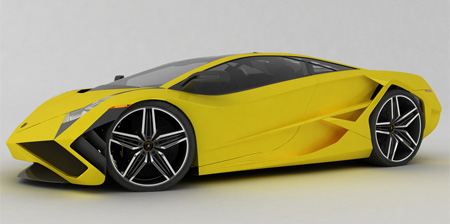
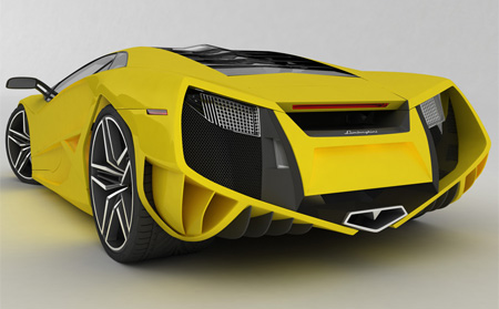
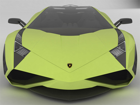
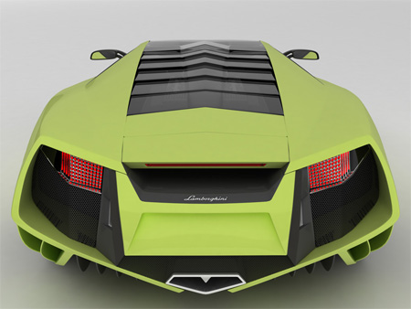
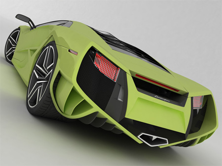
Emil Baddal, a talented artist from Iran, was not satisfied with the look of the Lamborghini Reventon, so he decided to design one himself. Enjoy!
Also check out: 12 Beautiful Concept Car Designs

Emil Baddal, a talented artist from Iran, was not satisfied with the look of the Lamborghini Reventon, so he decided to design one himself. Enjoy!


Also check out: 12 Beautiful Concept Car Designs

TheTvHangman
Now thats what im talking about! Does it come in red?
Jul 28th, 2009
heh
Awesome
Jul 28th, 2009
jargen
dude, that’s the sort of thing I’d expect to see in Transformers!
Jul 28th, 2009
KKL
somehow this remind me of those japanese papercraft model..hmmmm
Jul 28th, 2009
Matt
Seriously? This is the ugliest thing I’ve ever seen.
Jul 29th, 2009
Karin L. Stewart
SWEET! And it is in just my color to coordinate with my wardrobe! I’ll take it!
Jul 29th, 2009
tech-mad
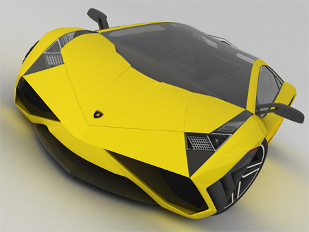
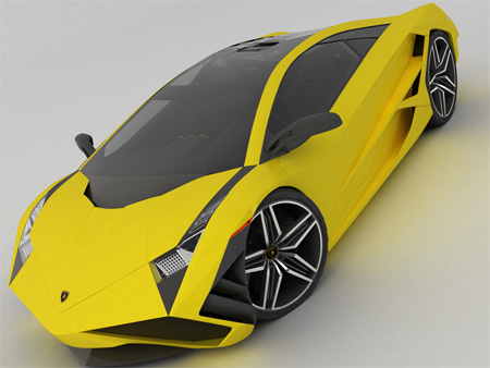
it has a gorgeous side-profile, but from the front it kinda has an ‘appalled’ expression or a look of dismay (see photo 6), doesn’t it?
Jul 29th, 2009
Graham
Yeah, i’m with matt, it’s ugly. Where are the nice curves??
Jul 29th, 2009
Bev
Okay, I love curves on a car but its beautiful… It reminds me of a cobra, or other dangerous snakes. Its so edgy, I’m simply in love.
Jul 29th, 2009
karlitta
Beautiful!
Jul 29th, 2009
Qwxsi
That’s ugly! Even David Hasselhoff wouldn’t drive a car like that.
Jul 29th, 2009
Isabelle
Wow. That’s so amazing. How could you guys think that that is ugly? Curves are so over used. No one drives anything with nice, crisp folds like that. It’s phenomenal. Think again, all of you.
Jul 29th, 2009
Vijay
Great model and renderings. I think the front lets it down, there is too much reference to snakes. I do like the light details, well done.
Jul 29th, 2009
Bim
That looks f-ing amazing! Evil! I love it!
Jul 29th, 2009
Joanne
Okay. So the design is fine and kind of sharp (plus fierce). This kind of concept is not rare but I occasionally see it on high ways and in public.
The yellow one is good, I must say. :)
The green one makes me wanna eat avocado. Hahaha!
Jul 29th, 2009
Joanne
OMG OMG OMG. I want to see the inside!!
Jul 29th, 2009
G
Let them focus on the poor and hungry in our world instead
Jul 29th, 2009
greg
U.G.L.Y U DONT GOT NO ALLABY U UGLY
Jul 29th, 2009
automotive designer
who the hell on earth does this to Lamborghini? was not satisfied with the look of reventon??? please erase the word “talented” I think this form totally sucks!
btw nice 3d presentation but the design, OMG!
Jul 29th, 2009
gary
There’s a good reason why professional car stylist/designers exist.
Jul 29th, 2009
danielvicente
I bet you could pick up 1000 times nicer ladies on that “getlaid-machine” than the ones you could in the cars of those who say this is ugly… This cars says “i have taste and i like to stand out of the croud”, not like other people cars wich says “i just wanna fit” (sorry if that hurt greg, matt, qwxsi and graham ;) )
Jul 29th, 2009
z
That is awesome! Why would anyone want “curves?” if you want curves go buy a 1990’s era car, they got plenty of curves. Anyone who says this is ugly already has disqualified themselves from having any taste/knowledge or concepts on cars. So people, do not take their comments seriously, they are confused.
Jul 29th, 2009
kevin
Great execution, Terribad design. The bodylines don’t flow well at all. All the extras are too gimmicky. Automotive design is about form AND function.
Great try, but try again.
Jul 29th, 2009
Martin
like somebody said there it is like something out of transformers. Not real life.
Jul 29th, 2009
lano
Don’t like it at all. It’s Ugly. It’s like stolen out of Transformers. Completely Hollywood, without character, without soul. Check out lamborghini Miura, That’s how a car should look!
Jul 29th, 2009
Paulius
This car looks like a pair of sneakers, Reebok I’d guess.
The making of a truly well designed car like anything else is not how far you can go with the design. It’s about being bold and aesthetically pleasing added with balance. Look at the Gallardo, Murciellago, and Lambos of past, they are ahead of the curb and very innovative designs, however they balance the art of technolgy with a crisp fluid design. A well designed car is a work of art, not something you would find in some Neo Mad Max film.
Jul 29th, 2009
John
This reason to go to war with Iran alone.
Jul 29th, 2009
Chet
I’m diggin’ it.
Jul 29th, 2009
Paul
Two words…Road Overkill
Jul 29th, 2009
Richard
Personally, I would like to see one between this and the current average consumer models in terms of edges and curves… And not like the newer models like the Nissan Cube, which is, in my opinion, really ugly. As for the Lamborghini, I think the fins are a bit excessive, and the could have been a little more creative on the front.
Jul 29th, 2009
Nate
Beauty if definitely in the eye of the beholder here. Looks like crap to me.
Jul 29th, 2009
Tiber
Do something with the airhole wedges in the front, and you’ll have my blessing.
Jul 29th, 2009
mytwocents
I’m not going to rip on someone’s fantasy car design. After all, it IS well executed and creative. Good job.
Jul 29th, 2009
Don
Its Awesome!!! But I bet you can`t even go on the sidewalk with that;
Jul 29th, 2009
divinefusion
Oh, I”m totally drooling. It official – I’m offering my test driving skills, call me!
Jul 29th, 2009
Oscar Blanco
3D render concept car btw, NOT PHOTOS (for those who think this is an actual car).
On regards to the design, there are some really nice solutions. The edgy lines are cool, but not within the Lamborghini style, which, even though it always has a tendency for straight lines and sharp angles, doesn’t go all the way to sharp edges and paper thin panels. Borders are gentle and soft, precisely to take away a bit from the hard angles and straight lines. I’ve always felt Lamborghini has some really cool looking vehicles, but sometimes they almost look not entirely aerodynamic because of the hard angles.
In general, this concept looks kinda frail, almost like a paper car. So I would say it’s a half way done solution, a first draft of a concept.
If I where a design exec at Lamborghini I would probably take it and find it’s good points to rescue and request modifications to some stuff, but then again, I’m not. So from a purely spectator point of view, and with a more limited knowledge of 3D design or Car concept design I will simply say, it’s a good concept, but not great.
Jul 29th, 2009
Bob Dobalina
I’m in the “It’s beautiful” camp. The lines on it are awesome.
Jul 29th, 2009
kelven cheah
excellent, kill all the road.
Jul 29th, 2009
Dayne
Something about it just screams XBOX 360… its not a bad thing…
Jul 29th, 2009
kainoa
I think most of you missed the point…it’s a CONCEPT. The point of a concept is to push new design ideas. If it were the same bland ‘curved lines’ stuff you see elsewhere it’d be boring and uninspiring. New, unique ideas are foreign at first, but the real idea is innovation. Something that inspires.
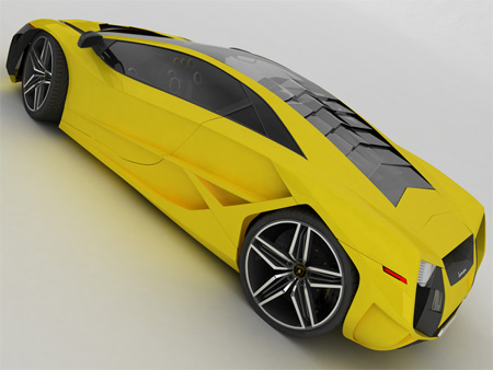
In that sense, i think this is totally successful. With that said though, i think the rear end appears to be smiling at me :)
Jul 29th, 2009
dethskwirl
does it go very fast?
Jul 29th, 2009
Don
should be black/ or red/ white…. but not…. poo-green =.=
Jul 29th, 2009
WetcoastBob
Nope!
@danielvicente The best babe magnet is an original Beetle convertable. Just dress well.
Jul 29th, 2009
Garrett Dabbs
Does anyone else notice that there is no forseeable way to get into the car as it has no door handles?
Jul 29th, 2009
P. Orno Dan
@ Garrett Debbs… Ur on a car site and u seriously never heard of shaven door handles? wow
As for the rest of u, yeah yellow or white be my choice it just so bold so crazy so different but screams try to take me on.
I love it, if i had the money i would build it right now
Jul 30th, 2009
meh
After producing millions of cars which appear to have been blown up with a straw in the tailpipe, has the roundmobile look finally played itself out?
The next logical step is to move on to the insect world and a host of bug-buggies, of course. I mean look at the lines on that thing (laff). All it needs are antennae.
Unbelievable what’s on the roads these days.
Jul 30th, 2009
eden
Looks like it’s invisible to radar
Jul 30th, 2009
jt
Nice. But that front shot looks like an angry bird.
Jul 30th, 2009
Rahul Srinivas
Ugly or not. This is one hell of a head turner.
Jul 30th, 2009
Trenchancy
Quote by greg:
“U.G.L.Y U DONT GOT NO ALLABY U UGLY”
-high fives-
Jul 30th, 2009
Sam
That is stunning – if you saw that front in your rear view, you would let it past !! – and the back looks like a wasps face ready to pounce on the road !!
Jul 31st, 2009
Kadeem
You guys are taking this WAY too seriously! It’s a CONCEPT. Sheesh.
Jul 31st, 2009
Uwes
This is too ugly for words!! OMW!!!
Jul 31st, 2009
delere
In this case it’s a good thing most concept cars don’t make it to reality. I just don’t find in attractive in any way.
Jul 31st, 2009
Krylun
Excellent Model and renders.
I’m not really a fan of the concept. A huge aspect of automotive design, in my experience, is knowing when to stop. More intakes is not always the answer, but to each his own. I also think that the Bertone wheel arches are a bit over the top.
And @z: If you say that if I don’t care for this design I have “disqualified [myself] from having any taste/knowledge or concepts on cars”, I guess I am confused and should probably reconsider my choice of career. Thank you.
Aug 1st, 2009
johnjohn
AWESOME !
when you dont like something then do it by yourself, the actual exercise is a success !
Really great execution about what was in your mind !
BRAVO
Aug 1st, 2009
naveed ahmad
WOW i neeeeeeeed one this is really nasty thing..great job lambo…
Aug 1st, 2009
Jaqi Mugo
Oh come on, you guys. Think origami, curves aren’t the only thing that make a car or woman beautiful.
I’m with Joanne, I wanna see inside. I’d also love to see this in other colours like red, black or metallic.
I became a Lamborghini fan today, this rocks!
Aug 1st, 2009
Thomas
The only thing I liked about it is the wheels
Aug 2nd, 2009
Tristan
They are very goog cars they raise up on speed bumps the resan wy i like a lamborghini is because the doors go up and i would realy like to by one if you would like to leave me a e mail my user is castrist248@sbcglobal.net by
Aug 2nd, 2009
Hyi vittu
it`s ugly
Aug 5th, 2009
Boshvek
B U T FULL i will buy 100 %
Aug 7th, 2009
raprap
Very nice ability with the rendering. A little too much anglular for my taste. Can it be too cutting edge?
Needs to be softer. I’d like to see the wind tunnel analysis. I bet there would some conflicts.
Aug 7th, 2009
ShaYan
ONLY IRANANIAN ARTISTS!
Best.
Aug 8th, 2009
Shahin nOiS3
WOW It’s Super Car
I wish to ride With it
Aug 8th, 2009
jamie \m/(*.*)\m/
lovin’ it! im sorry but who honestly goes “hey i think im gonna design a lamborghini today.” and then accomplishes making a beautiful car…
Aug 8th, 2009
Yousef
oooooh,what a surprise,thanks IRANIAN MAN.
Excellent
Aug 10th, 2009
Craig
Sorry Emil, but this is a perfect example of why I object to putting high end CAD rendering tools in the hands of untrained designers. The rendering looks good of course but the design is quite poor.
Aug 12th, 2009
Adam
They need to flatten that back end out so it isn’t so much of a V shape and it will be perfection!
And as for the design being poor, that is the most ridiculous statement that i have ever had the misfortune of reading!
Try a little harder next time!
Aug 16th, 2009
Shubrus D. Infurnus
horribly awesome!!!!
Sep 4th, 2009
cameron
I’m sorry but, the design is much to much, Lamborghini has class, hertige, and respect, this car looks like it tries so hard to get attention when all lamborghini’s have other car companies saying “make a car like Lamborghini” the car (in my opinion) is much worse than the Reventon.
Sep 21st, 2009
cameron
The wheels are good though, not better than reventon’s though.
Sep 21st, 2009
Fred R. Wallace
Can I pre-order? I’m serious
Oct 12th, 2009
Tyler
I have never seen an ugly Lamborghini before but this one comes close. There is a reason that car designers work in pairs not alone, plus who doesn’t like a Lamborghini Reventon? That is the best car in the world but I hope to own a Murcielago in a few years
Nov 1st, 2009
jonkibwe/jonkibway
that is the hottest car i hav seen eeeeeeevvvvvvvvvveeeeeeerrrrrrrrrrrrrrr
Dec 17th, 2009
Masoud
So Beautiful!!!
Jan 7th, 2010
Hessam
Nice job dude. It seriously IS in Lamborghini style, but you should rethink about the rear view. The V view of the rear part of the car is so ugly i think.
Feb 20th, 2010
Manish Ahuja
I LOVE the look of the tires on that thing.Simply AWESOME
Apr 19th, 2010
Kevin
Better design than a Reventon? Ummm NO. But kudos for the time invested.
May 24th, 2010
Lambo-wanter
That car could be pretty gangster if you pimped it a bit, gave it sum N20, new skiet and a wing, but yeh i want it
Nov 2nd, 2010
ignacio
AWESOME CAR JUST AWESOME
Nov 14th, 2010