
We see beautiful movie posters every time we go to the theater, however, most people never take the time to fully appreciate all the hard work that goes into their creation. Not only do movie posters promote the films, they can also be a great source of inspiration.
In today’s post, we showcase our favorite examples of creative movie poster designs. Please note that we only included posters for movies that came out after the year 2000.
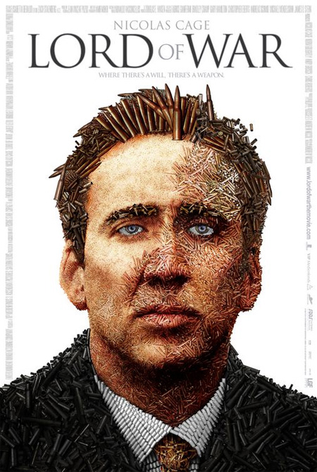
Lord of War (2005) Poster
Constantine (2005) Poster

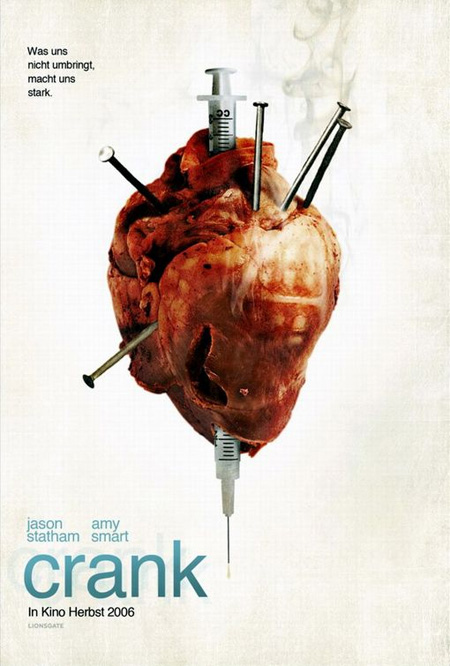
Crank (2006) Poster
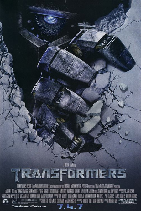
Transformers (2007) Poster
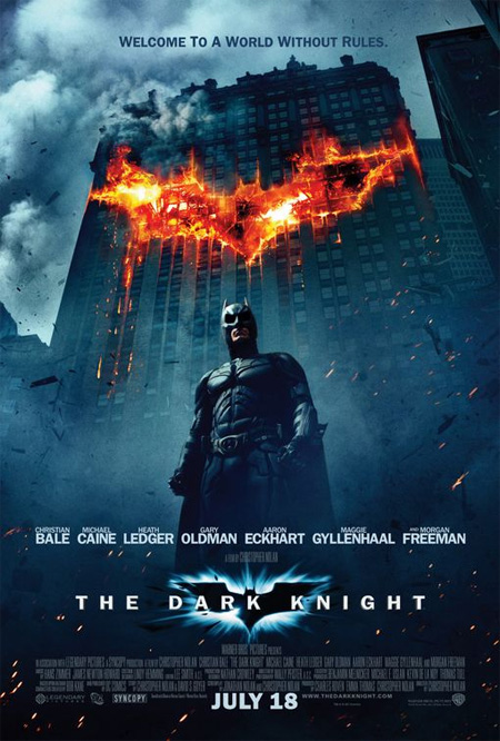
The Dark Knight (2008) Poster
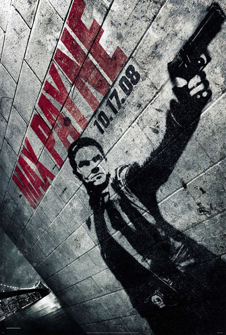
Max Payne (2008) Poster
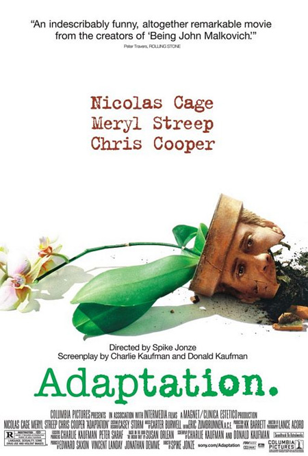
Adaptation (2002) Poster
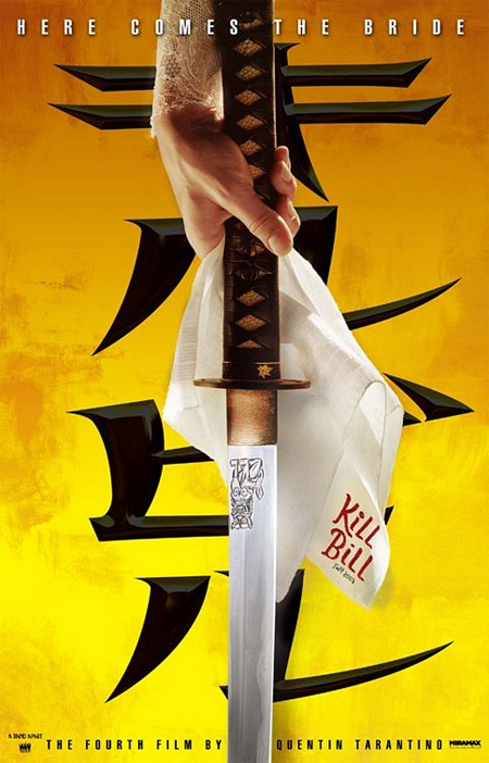
Kill Bill: Vol. 1 (2003) Poster
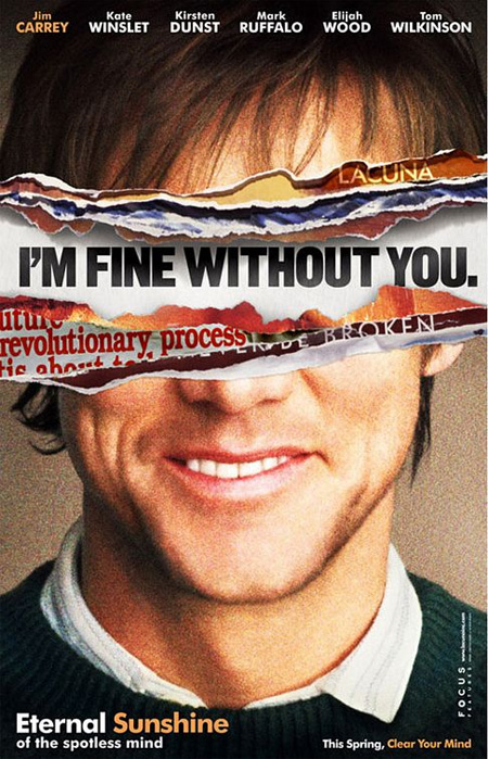
Eternal Sunshine of the Spotless Mind (2004)
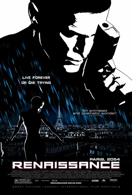
Renaissance (2006) Poster
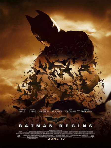
Batman Begins (2005) Poster
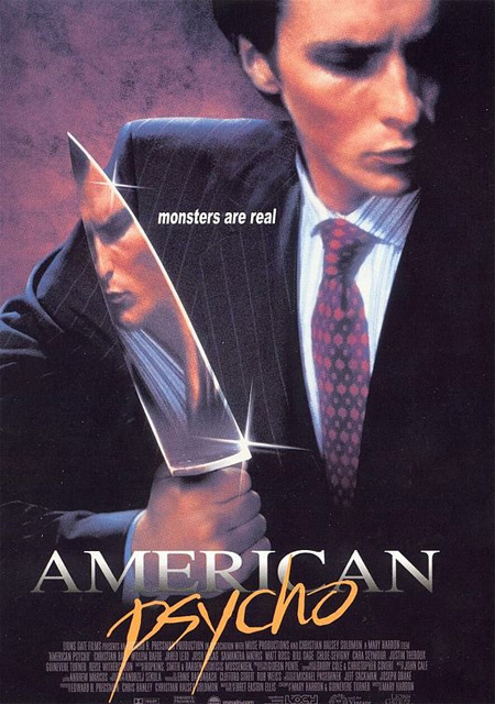
American Psycho (2000) Poster
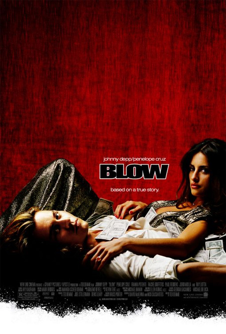
Blow (2001) Poster
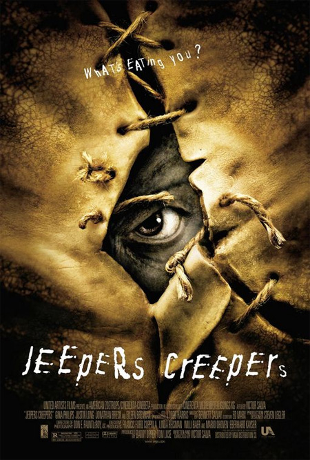
Jeepers Creepers (2001) Poster
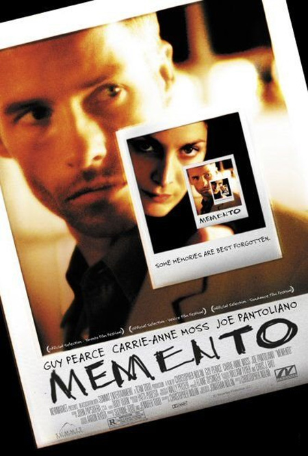
Memento (2000) Poster
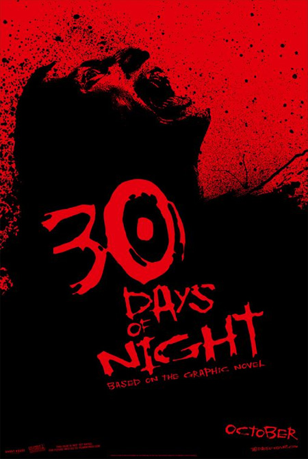
30 Days of Night (2007) Poster
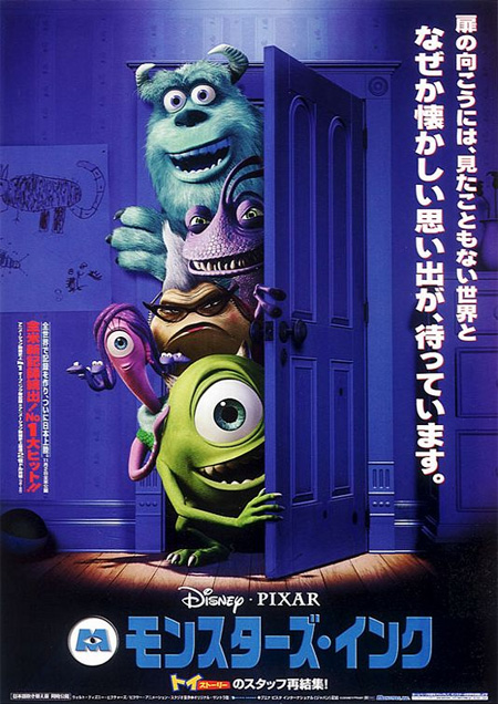
Monsters, Inc. (2001) Poster
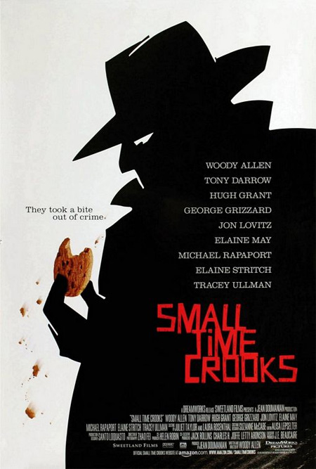
Small Time Crooks (2000) Poster
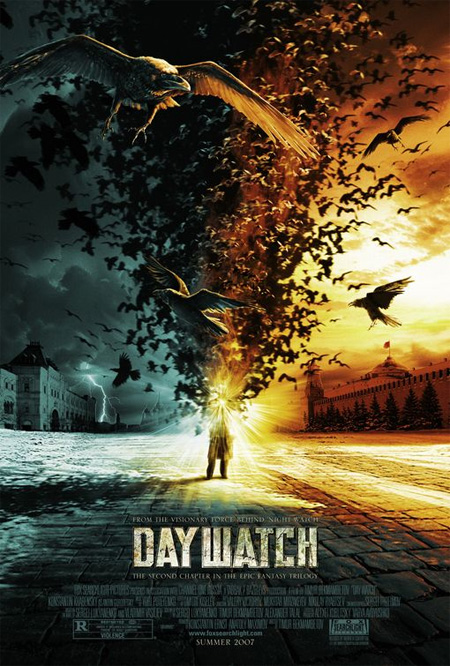
Day Watch (2006) Poster
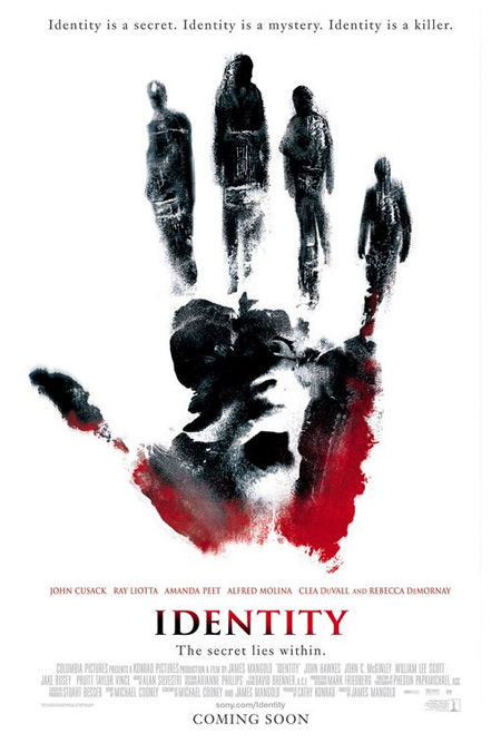
Identity (2003) Poster
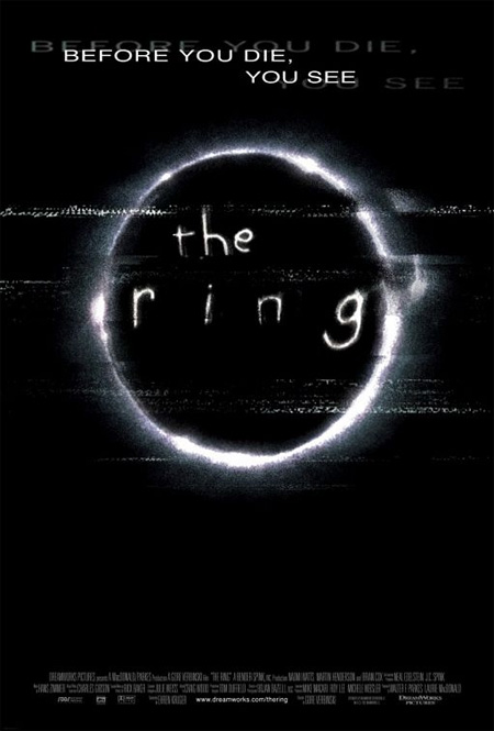
The Ring (2002) Poster
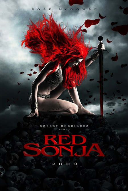
Red Sonja (2009) Poster
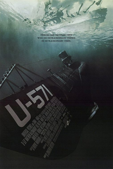
U-571 (2000) Poster
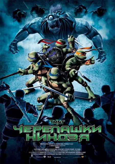
TMNT (2007) Poster
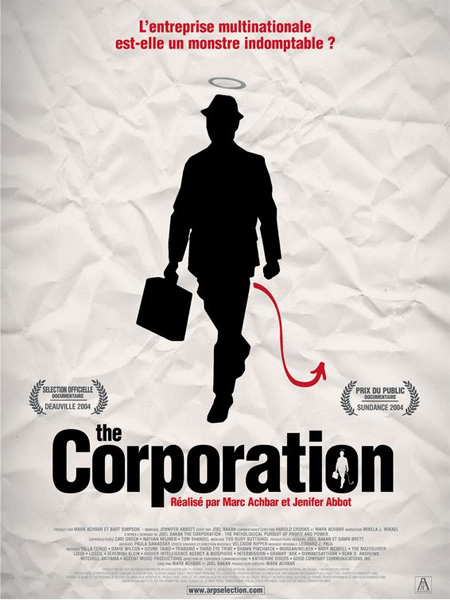
The Corporation (2003) Poster
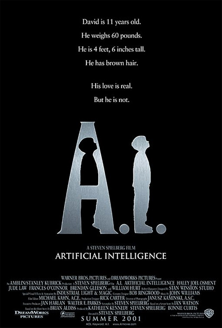
A.I. Artificial Intelligence (2001) Poster
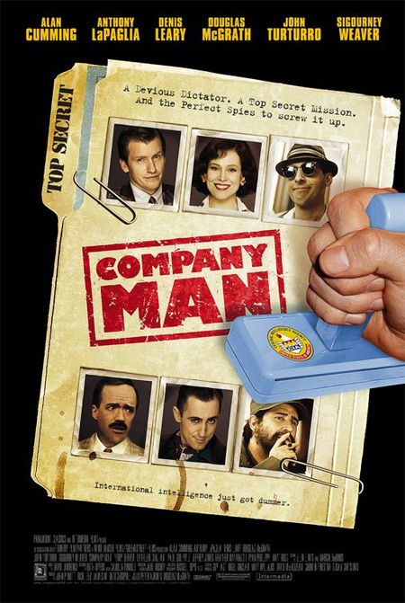
Company Man (2000) Poster
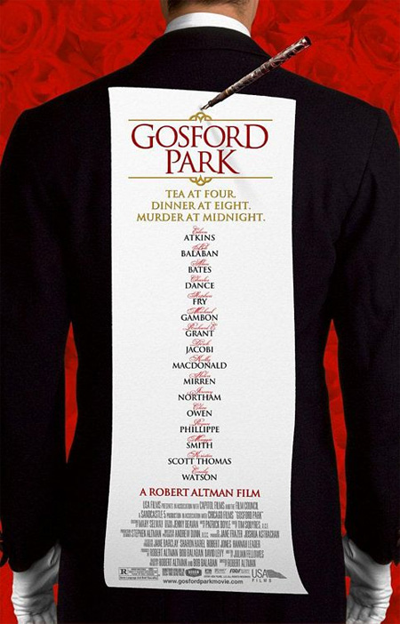
Gosford Park (2001) Poster
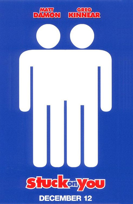
Stuck on You (2003) Poster
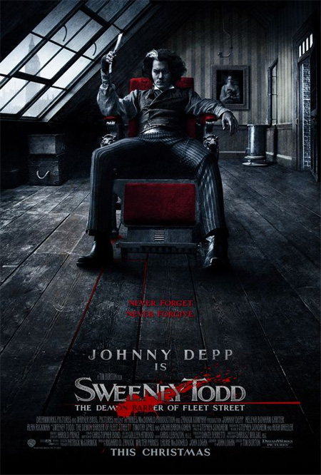
Sweeney Todd (2007) Poster
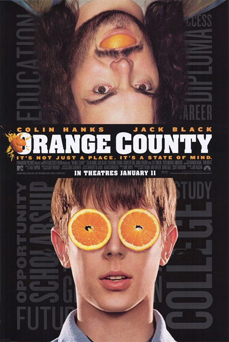
Orange County (2002) Poster
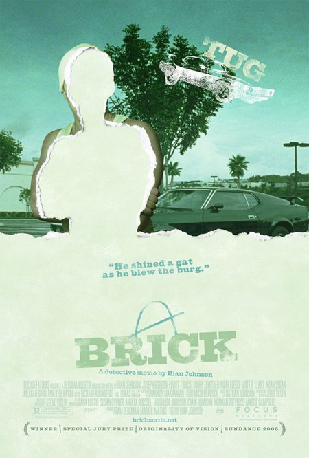
Brick (2006) Poster
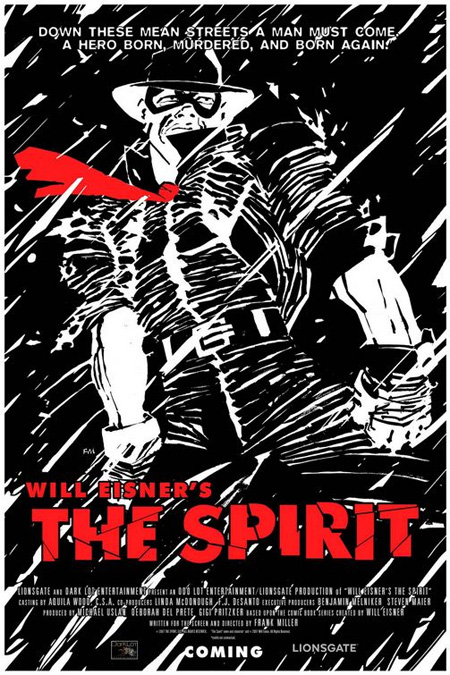
The Spirit (2009) Poster
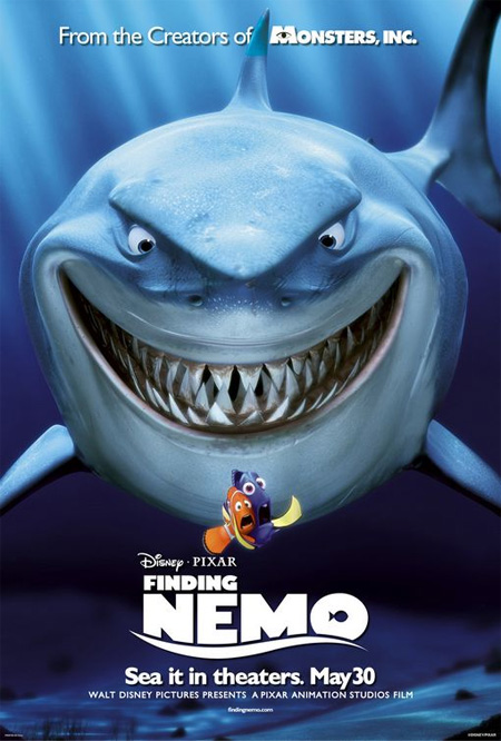
Finding Nemo (2003) Poster
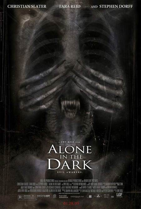
Alone in the Dark (2005) Poster
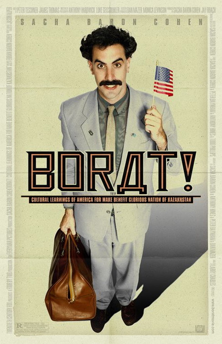
Borat (2006) Poster
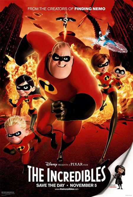
The Incredibles (2004) Poster
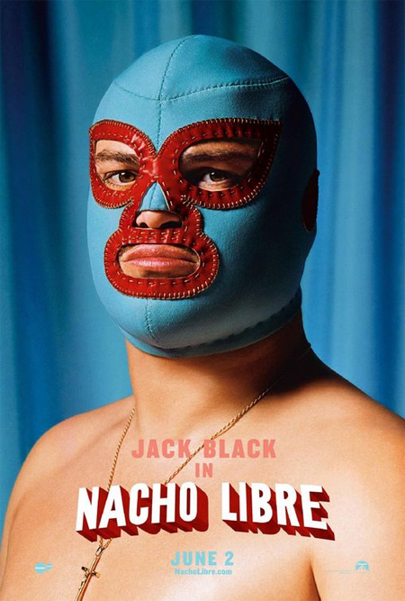
Nacho Libre (2006) Poster
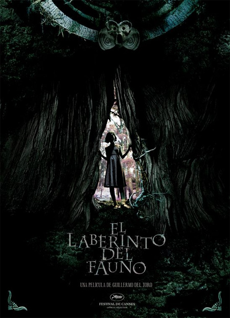
Pan’s Labyrinth (2006) Poster
Dead Silence (2007) Poster

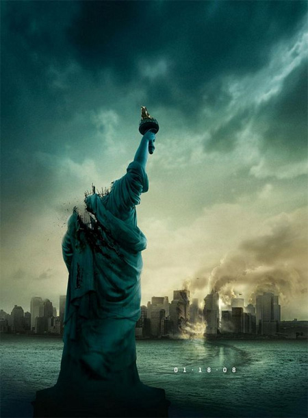
Cloverfield (2008) Poster
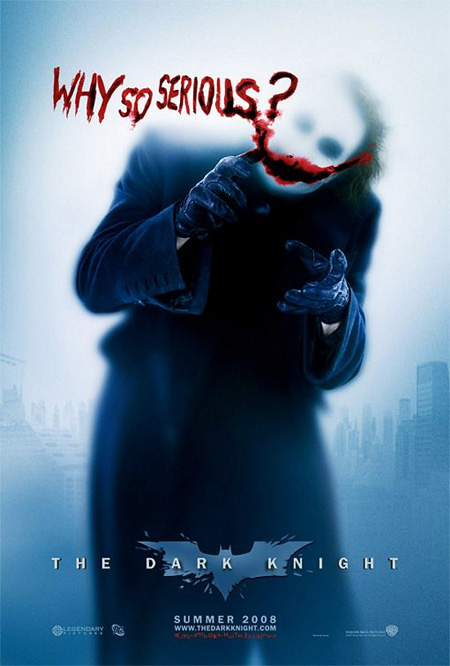
The Dark Knight (2008) Poster
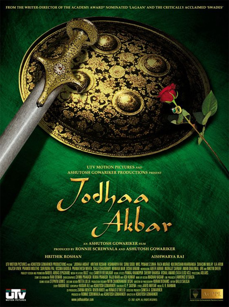
Jodhaa Akbar (2008) Poster
Also check out: Movie Posters from Behind




kim
a good movie poster does not a good movie make
but for some exceptions of course!
Aug 25th, 2008
Naskar
What’s so creative about the last one
Aug 25th, 2008
Fred S.
The Dark Knight posters are the best! Awesome movie too!
Aug 25th, 2008
tomsmith
some of these are not creative at all
Aug 25th, 2008
Robert
Can’t wait for The Spirit movie.
Aug 25th, 2008
Meg
The “Why So Serious?” poster is the best one I’ve ever seen. So clean, so mysterious, and follows the style of the movie.
Aug 25th, 2008
Alex G
i think the last poster is actually quite creative because of the symbolism. you have a sword, a shield, a rose and a ring. now, i haven’t watched this movie but i can imagine what it could potentially be about just from considering what those items represent.
Aug 27th, 2008
Adam
Some of the posters above really are ingenious, but others are rather unexceptional. I’ve seen some really outstanding movie posters of the years, and I wonder why stuff like Constantine, Transformers, and Monsters, Inc. make the cut. I get the impression that posts on this site are reviewed by no one but the author. I just have the feeling a team working together would be able to review the content and weed out most of the mediocrity. Don’t get me wrong: This is a good site with some really interesting stuff. However, I’m bothered because I know it has the potential to be an excellent site if it really gets things together.
Further, it seems lazy and amateurish to just throw up posters, ads, etc. without commentary on why they are special. Give us some insight on why they made the list. Without the commentary, its doubtful that this can even be considered Fair Use.
Aug 27th, 2008
windo
nice collection. christian bale in 3 of ’em.
Aug 28th, 2008
rex
I realize the tension building. Blogs are for free review and the DIY approach.
Not everything has to be annotated and/or explained! Take from it what you will.
Design that can be surpassed like movie posters have to be recognized.
Great work!
Aug 29th, 2008
tasarimci
;=)
i think the last poster is actually quite creative because of the symbolism. you have a sword, a shield, a rose and a ring. now, i haven’t watched this movie but i can imagine what it could potentially be about just from considering what those items represent.
Sep 30th, 2008
kirtasiye
:D yea
What’s so creative about the last one
Oct 1st, 2008
altınbaş
Can’t wait for The Spirit movie.
Oct 1st, 2008
baba
nice collection. christian bale in 3 of ‘em.
Oct 17th, 2008
Ben
Hah! Some great and not so great ones here but I have the “why so serious?” dark night one. Great poster.
Oct 22nd, 2008
pelin
the darknight :)
Oct 26th, 2008
puja
heights of creativity……….its good to an indian movie poster in this section….. great work… simply amazing
Oct 30th, 2008
sofalump
I think it is a great idea & great posters. Alot of People will look at a poster & each one will see a different view of it.
Nov 30th, 2008
Borndemented
What’s so creative about the TMNT? ok so the last one may have some symbolism but still a weak way to represent it… TMNT just doesn’t belong here
Dec 1st, 2008
izmild
I’ll collect them! Very nice posters…
Dec 9th, 2008
shanagwa
That first dark knight poster is really cheesy. I hate that batman card it looks like generic and stupid. There are some pretty good ones but you aren’t very selective.
Dec 16th, 2008
sonora
while i know we are not delving into posters before 2000, i would like to suggest the poster for the 1997 movie The Game with Michael Douglas’s face becoming the puzzle fragments… If you liked these you will enjoy this:
http://thisdistractedglobe.com/wp-content/uploads/2008/02/the-game-1997-poster.jpg
Jan 3rd, 2009
Simon Page
Nice selection – here are some more…
http://simoncpage.co.uk/blog/2009/01/05/creative-movie-poster-inspiration/
Jan 5th, 2009
Erin
I am disapointed with this list. alot of these were so….boring. Not creative at all. What happened? you couldn’t spend as much time with this list as you did the other stuff on this site?
Feb 19th, 2009
Ihtesham
Thats a great list and beautiful posters also.
Jan 25th, 2010
Mr Mirror
ok… how’s that knife reflection possible again???
(American Psycho Poster)
Jun 21st, 2010