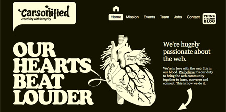
The flexibility of Cascading Style Sheets (CSS) allows web developers to design stunning websites that look great and are easy to navigate.
This post features our favorite examples of beautiful and creative website designs from all over the world.
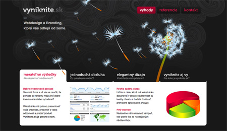
01 – Vyniknite – http://www.vyniknite.sk
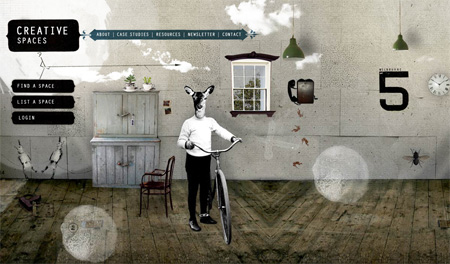
02 – Creative Spaces – http://www.creativespaces.net.au
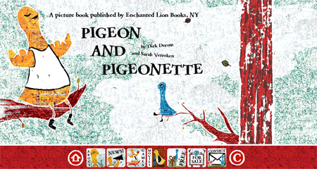
03 – Pigeon and Pigeonette – http://www.pigeonandpigeonette.com
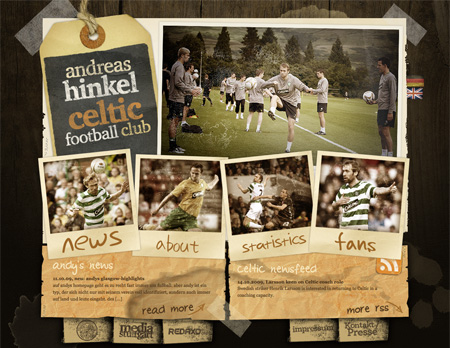
04 – Andreas Hinkel, Celtic FC – http://www.andreashinkel.com
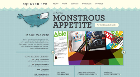
05 – Squared Eye – http://www.squaredeye.com
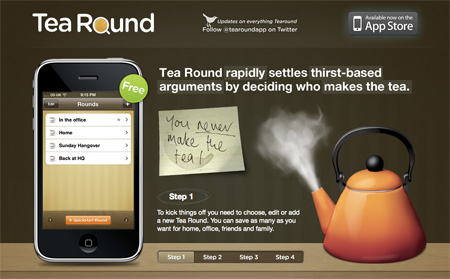
06 – Tea Round App – http://www.tearoundapp.com
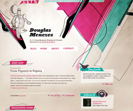
07 – Doug Menezes – http://douglasmenezes.com/wp/
08 – Shannon Moeller – http://www.shannonmoeller.com
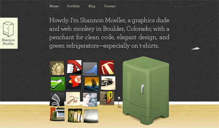
09 – Kyan Media – http://www.kyanmedia.com
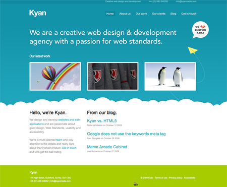
10 – BlackMoon – http://blackmoondev.com
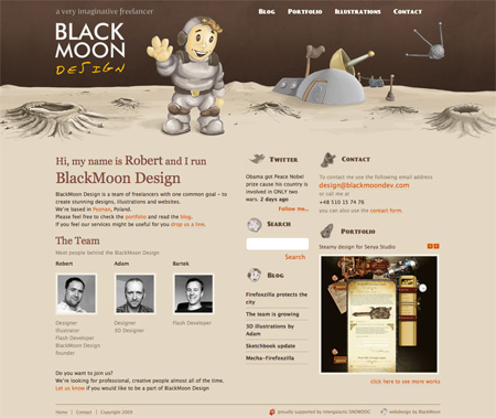
11 – Orman Clark – http://www.ormanclark.com
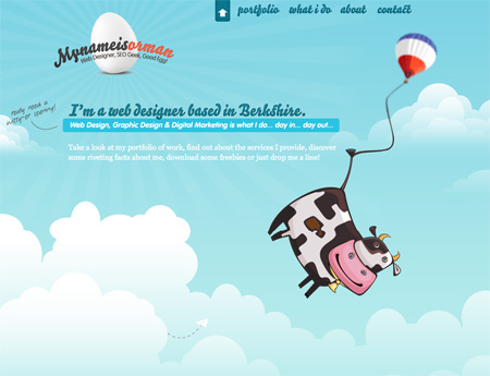
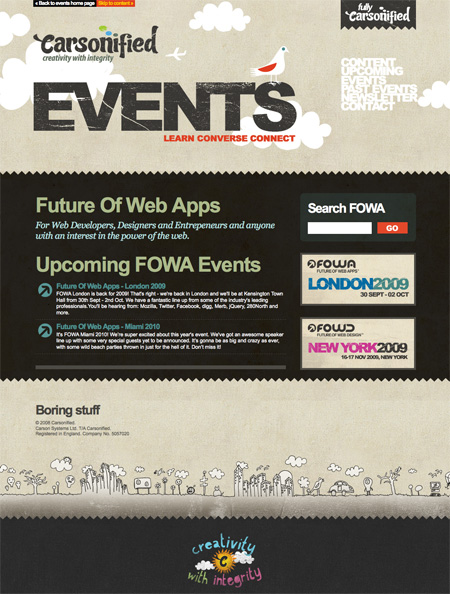
12 – Carsonified Events – http://events.carsonified.com/fowa
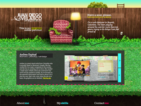
13 – Juan Diego Velasco – http://www.juandiegovelasco.com
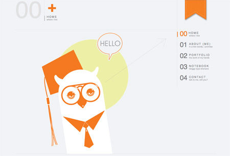
14 – JOE NYAGGAH – http://danjoedesign.com
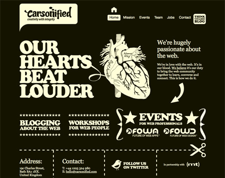
15 – Carsonified – http://www.carsonified.com

Megan
It has been a while since you guys had a web design post! I am glad these posts are back and want to see more of them in the future.
Oct 14th, 2009
tech-mad
i can’t choose any favs! they’re all great in their own way!
Oct 15th, 2009
Yuu
Nice! I like seeing web designs with CSS instead of massive amounts of flash for a change.
Oct 15th, 2009
Web Design Lebanon
Nice list. CSS is search engine friendly and Flash is not all evil! it can provide a rich user experience. The important thing is to find the balance to meet your target audience expectations.
Oct 15th, 2009
Mondo Print
Web Design. Hooray! Thanks for sharing these. I agree with tech-mad. It’s hard to pic a favorite.
Oct 15th, 2009
Dan Black
Great Post! keep it up!
Oct 15th, 2009
RK
“Hi! My name is so and so and I’m a cliche!”
Oct 15th, 2009
Kelsey
These are all beautiful. I wish I could design like that.
Oct 15th, 2009
Arek
Hm, Kyan Media looks a lot like Skype – coincidence?
Oct 15th, 2009
frank katzer
nice selection – also very different but all modern examples – thanks!
Oct 15th, 2009
tolin
this web is cool..
Oct 15th, 2009
mark
While some of these layouts are interesting, the content is incredibly busy–some I’d describe as messy.
Most of them (I clicked thru about half before getting bored and annoyed) use the current trend of wasting screen real estate with enormous headers that push the content off the screen. Scrolling down to see more content is fine for actual content pages but on homepages–which are essentially linkpages to the rest of a site–should make finding content easy–not complicate it by forcing you to scroll to find the links to the content. *shrug*
Even the cleanest design–joe nyaggah–forced me to scroll down because I thought there was more to the homepage only to find–nothing. Just the bottom of the image (to say nothing of the fact that I have no idea what joe does from his homepage. Is he an artist? designer? a firm? a personal page?
sorry. this group doesn’t work for me.
Oct 15th, 2009
John (Human3rror)
awesome. love that cow too.
Oct 15th, 2009
Josh of Cubicle Ninjas
Beautiful list! Very inspiring.
Oct 15th, 2009
Vishnu H (Kerala)
Really great list. Love all those wonderful designs, and I tweeted it from Delicious Hotlist, and got 3 re-tweets within 10 minutes!
Oct 16th, 2009
naveed ahmad
some really new stuff here..i am thinking whats gona come next after all this..where will this web 2.0 go :)
cant wait for future !!!
Oct 16th, 2009
Ivan | Jobs Blog
Hard to choose, but Kyan Media stand out as the nicest. Black Moon as the second…
for 75% of the designs above – I would be happy to replace my curent web site design with! :)
Oct 16th, 2009
mynameisorman
Hi, thanks for featuring my site! Some interesting comments here too which I will take note of. Thanks.
Oct 16th, 2009
Bre
Cool stuff!!!
Can someone point me to a good site for CSS/Flash tutorial? Something ‘in 3 days’ or ‘for dummies’…etc :)
Thanks
Oct 16th, 2009
Robert Foxx
@mark – agreed. The current swing back to giant headers (we went through this five or six years ago) coupled with the emergence of netbooks (with smaller screens) as a popular way to access the net demonstrates that most of the designs on this list were put together on hi-res screens without a care in the world. All are great designs for the sake of design, but show me great designs where usability was a consideration and then I’ll be impressed.
Oct 16th, 2009
Shane
These are all great website design. Really like the Carsonified website.
Thanks for sharing.
Oct 16th, 2009
Matt Ackerson
Very high quality website designs. I’m impressed.
Oct 16th, 2009
John
I like the internet.
Oct 16th, 2009
Karin Stewart
This is the first post on web site design. Glad to see what’s creative out there!
Oct 16th, 2009
Anthony Altemara
These designs seem very busy, and not at all content-focused, which is what I would expect to see in modern web design. People don’t have time to hunt for what they need. With mobile browsers, etc… accessing the information.. sites must account for these growing percentages of viewers. It’s not modern unless you can be usable and look good on a netbook and iPhone as well.
Show me a site that is appealing across a variety of devices AND has the content as the main draw for the eye, THEN I’ll be impressed.
Oct 17th, 2009
Jabari Holder
Nice post, they are all well designed and graphically intense but most still have the basics intact which is good. The cow in 11.Orman Clark is kina scary though lol
Oct 18th, 2009
Robert
Thanks for featuring our site – the rest of the list is also awesome!. Cheers
Oct 19th, 2009
bayilik
I liked CFC and Carsonified WEB very much.
Oct 21st, 2009
Peach
All of these sites are awesome. Thanks for sharing. These are all nice and clean.
Oct 27th, 2009
Doug Bartow
“modern” ?
That’s the wrong word here, especially when you are speaking critically on design.
“contemporary” or “new” would be more appropriate…
nice work, but not modernity is not represented above.
Oct 27th, 2009
Sklep wędkarski
Vyniknite is awesome!
Nov 7th, 2009
Burukutuk ~
I don’t like that’s too colourful or too simple. Boring…!
but love carsonified (only that one) :)
Dec 29th, 2009
Si Ganteng
really nice. inspire me..
Jan 9th, 2010
alberto
Not impressed.
Those are beautifully crafted visual designs. But web design is not about “beautifully crafted visual designs” anymore. What about multiple devices? How easy are they to update, to transform, to make them evolve based on the business needs without calling the developer every week and paying for it? It´s nice to see beautiful things, but sometimes it´s also quite unpractical, the beauty has move to the content, to the activity, to the quality of the interaction with the customers. Nice designs but definitely not modern.
Jan 20th, 2010
J.R. VanWassenhove
Thanks for posting these. I agree, it’s cool to see good CSS with clean type. I love flash, but these look they’d have much faster load times. Have you ever checked out open source site designs? Similar to these, and great to use as a foundation to build on top of.
Jan 20th, 2010
claire stokoe
I do love the Carsonified designs, so fresh and clean. Working with SEO’s i understand that there has to be a meeting of optimisation and design, so many times one wins over.
great selection
Jan 22nd, 2010
James
many good ideas
Mar 1st, 2010
Thomas Craig Consulting
very nice work and some excellent elements of inspiration, love: Vyniknite, Andreas Hinkel, Celtic FC, and Black Moon. All very well done.
Mar 21st, 2010
javad pourhosaini
really so amazingggggggggggggg
Apr 4th, 2010
Gestalter
great now i have to re do my website :S
Jun 1st, 2010
Peter Lewandowski
Nice collection !
Nov 1st, 2010
Robbie Douglas
Some brilliant examples here. Great inspiration!!
Feb 17th, 2011