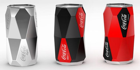
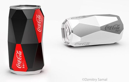
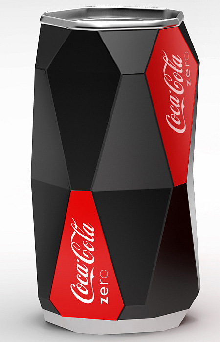
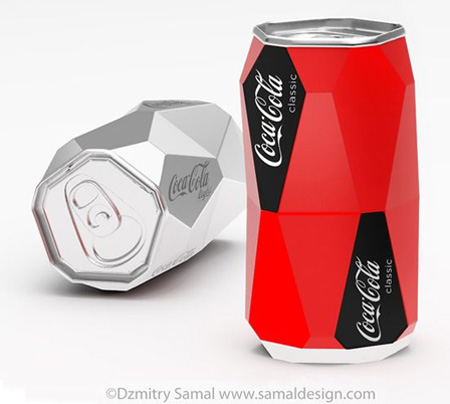
Interesting Coca-Cola can concept, designed by Dzmitry Samal, has a very distinct look and does not roll when placed on its side.
The new can design utilizes a process called impact extrusion, a process where an aluminum slug (solid piece of metal) is pressed at a high velocity with extreme force into a die/mold by a punch.
Also check out: Cube Bottle and Square Coca-Cola Bottle




Megan
Looks beautiful, but it will probably cost more to produce.
Nov 29th, 2009
Gonzo
Woa, great! I like the black one.
Nov 29th, 2009
sfdadadf
why would we need to place it on its side?
just saying its cool but why
Nov 29th, 2009
sean
will never happen. sorry you fail..
Nov 29th, 2009
Thiago Paulino
Pretty nice concept! I don’t have any idea about how this could be industrially produced, but it’s vary nice!
thanks for sharing!
Nov 29th, 2009
jingpi
cool .i like it
Nov 29th, 2009
JoeViturbo
I don’t think Coca-Cola will appreciate the coffin-shaped designs incorporated into the can. They’ll do all they can to keep the idea of death from being associated with their product
Nov 29th, 2009
Dill Doe
Coke Goth
Nov 29th, 2009
hesingswithfrogs
That is SWEET!
Nov 29th, 2009
Steven
I do like the uncolored model. I remember stumbling across another can which was similar; it was just plain aluminum with the same design as the present can, only the logo was embossed into the aluminum rather than painted on.
I like the idea of plain, unfinished cans but I doubt it will catch on.
Nov 29th, 2009
Karen
its super cool, but i think it would be better as a glass collectors edition rather than a hard to make metal can that is uncomfortable to grip…
Nov 29th, 2009
Tachik
While it’s an interesting concept to keep your can from rolling away if you ever drop or tip it over, the design invokes the image of coffins and there by the idea of death.
along the same lines…
Pepsi inadvertently (I would assume) is using a logo which invokes the image of a fat man (the red being his shirt and blue his pants — the white being his belly bulging out between the two) it there by connects the product with getting fat.
One thing all companies and designers need to look at are all the ways the product designs can be interpreted in order to avoid such blunders
Nov 29th, 2009
carlos
I want to drink out of one now…..
Nov 29th, 2009
Ben
The real reason this won’t be mass produced is not due to marketing as others have mentioned, but physics.
A regular can is very efficient at maintaining structural integrity under different levels of pressure (that concave dip under the can aids in that purpose).
This design would pop into different shapes if the can is shaken (or heats up), and may be more prone to dents during shipping.
Nov 30th, 2009
Roland
well, this is beautiful, but won’t be produced anyway :) One thing is that Ben mentioned about the quality of such can. Well, the wall of the can will be thicker and it will be more stable in case of inside pressure. Another thing is that production price will grow 10 or 20 times to produce such can. So, cool, beautiful but unreal :)
Nov 30th, 2009
Hillie
It would be great for promoting the next World championship of soccer in Africa.
Coca Cola always brings out special can’s for the WK.
Nov 30th, 2009
Matches Malone
@Megan: Especially since the environmentalist wackos got the largest aluminum plant in the US shutdown….
Nov 30th, 2009
Pedro Gonzalez
would that stand the pressure inside the can?
why change something that works so fine?
Nov 30th, 2009
FoxyBoxers
cool, but utterly useless.
Nov 30th, 2009
Karin Stewart
Have you ever unpacked a case of cans only to have them scatter EVERYWHERE!!! Great idea! Hope it doesn’t cost more but I think these guys like to take every option to get more money out of us. LOL!!!
Nov 30th, 2009
itsbrandnew
this is a very cool idea! Stylish and innovative!
Nov 30th, 2009
Spun Monkey
nice idea, but i don’t think coke would move away from their ‘dynamic ribbon’ design which they have trademarked and made special note of it on the cans in Aust.
Nov 30th, 2009
Gary
Nice one except it seems like this design has been ripped from a doritos design earlier this year…..it’s a little to similar for my liking.
check out what I mean I might be wrong.
http://www.toxel.com/inspiration/2011/02/14/doritos-packaging-concept/
ps, I do wish drink cans where as exciting as the one above.
Dec 1st, 2009
Sri Lestari
owesome
Dec 1st, 2009
butik muslimah
wow!! it’s so cool…
like a prism box..
when will look out of it??
Dec 2nd, 2009
Lee
Hate it!
Dec 5th, 2009
Will
I think people need to realize that just becasue it’s different, it’s not nessecarily good. Part of what makes cans attractive in the first place is the streamlined, straight, simple edges, not to mention aforementioned structural advantages. Plus, as has also been mentioned, it woul greatly interfere with Coke’s perviously existing trademark designs. Sorry guys, thumbs down.
Dec 10th, 2009
kaffy
very pretty!
Feb 24th, 2010