
After the success of our 24 Green CSS Website Designs post, we decided to showcase another collection of great designs.
This time, we feature 24 beautiful red CSS website designs.
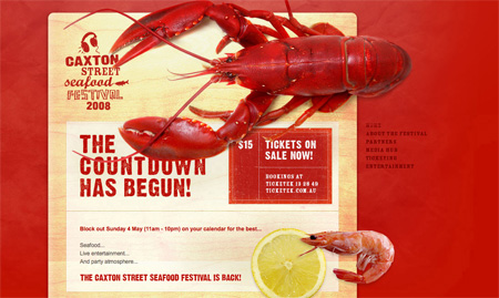
01 – caxtonstreetfestival.com.au
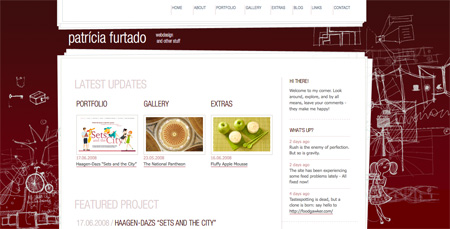
02 – patriciafurtado.com
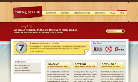
03 – thirdandgrand.com
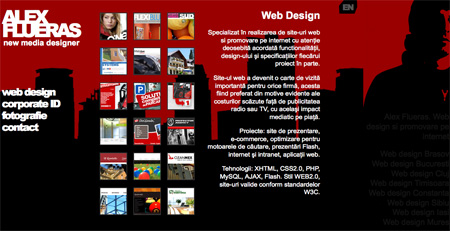
04 – alexflueras.ro
05 – corkd.com

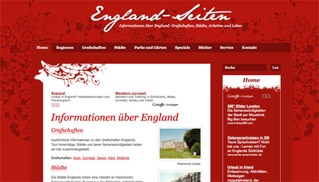
06 – england-seiten.de
07 – revolutiondrivingtuition.co.uk

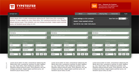
08 – typetester.maratz.com
09 – mootywebdesign.com.au

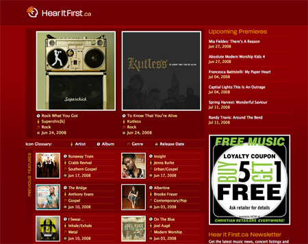
10 – hearitfirst.ca
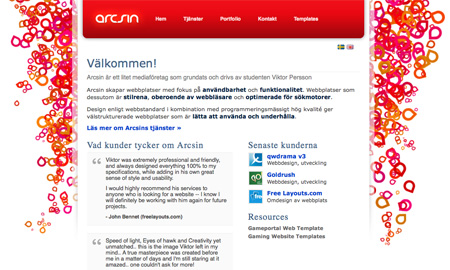
11 – arcsin.se
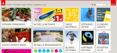
12 – mpreis.at
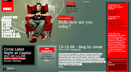
13 – umek.si
14 – helldesign.net

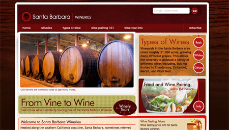
15 – santa-barbara-wineries.com
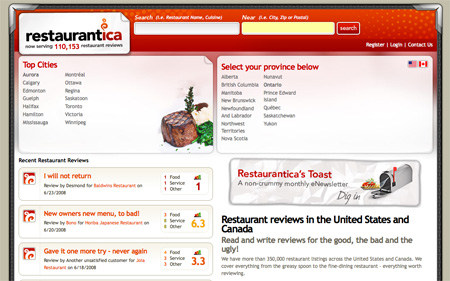
16 – restaurantica.com
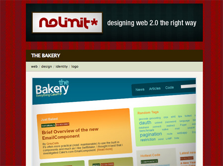
17 – portfolio.nolimit-studio.com
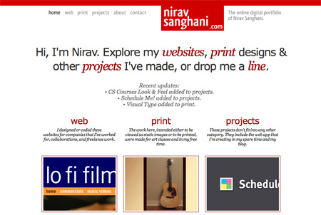
18 – niravsanghani.com
19 – emerils.com/holidaytogo/

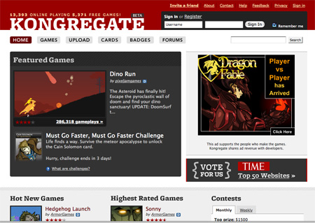
20 – kongregate.com
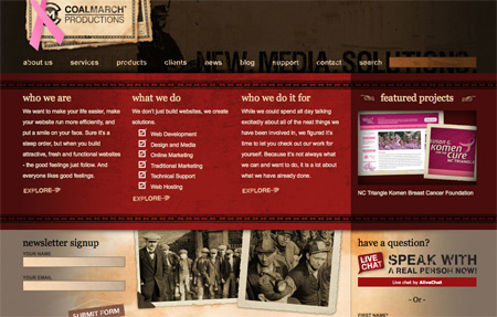
21 – coalmarch.com
22 – godmotherbackup.com.au

23 – psdtuts.com

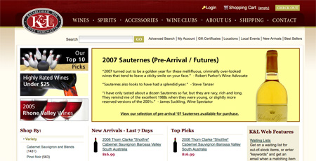
24 – klwines.com

Jane
Awesome! I think the first design is the best.
Jun 23rd, 2008
Brian Wiltshire
Really nice
Jun 24th, 2008
Renato
muito legal =D
Jun 24th, 2008
rahulmax
awesome collection! Dugg!
Jun 24th, 2008
Janet
Hot… hot… hot…
Jun 24th, 2008
Janko
Interesting idea to show red collection. I like it!
Jun 27th, 2008
Adam
The most eye-catching for me was 13, umek.si.
godmotherbackup.com.au, on the other hand, was disturbing. I was assume it’s some kind of illusion to Cinderella’s fairy godmother, and I have trouble seeing the connection to backup. Second, the noose is disturbing and will remind some of others they know who have committed suicide. Bad idea. And lastly, the “ask and you’ll retrieve” is a pun on a quote from Jesus Christ, further confusing the use of “god” int he site’s title. I’d say it’s a case of bad branding.
Jun 29th, 2008
dennis
I have to agree about the noose. A bad idea for a web site design.
Jul 7th, 2008
nick
c9AuJq hi! hice site!
Jul 29th, 2008
Angie Bowen
Great showcase, red isn’t the easiest color to design a website with.
Jul 29th, 2008
tasarimci
ooooOO yeaaa….
tenx
Oct 1st, 2008
Curvball
Here’s another one for your ‘red’ showcase – it really is all red :) – http://www.pixeldeath.com
Oct 8th, 2008
ingilizce
Interesting idea to show red collection. I like it!
Oct 14th, 2008
baba
awesome collection! Dugg!
Oct 17th, 2008
gazeteci
amazing
Nov 6th, 2008