
After the success of our 14 Creative Advertisements post, we decided to post another collection of creative advertising ideas. Enjoy.
Formula Toothcare Advertisement
“builds strong teeth”

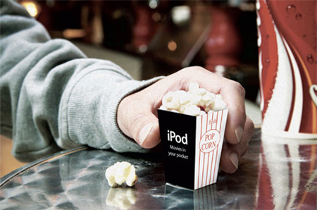
iPod nano Advertisement
FedEx Advertisement
Amusing FedEx ad that features UPS inside the Fedex truck. The words on the UPS truck are German. Competitive advertisement at its best.

Ironing Service Advertisement
Advertising Agency: BJL, Manchester, UK.

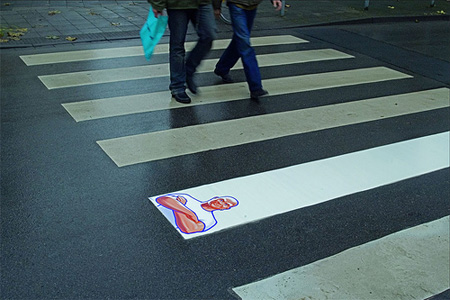
Mr. Clean Advertisement
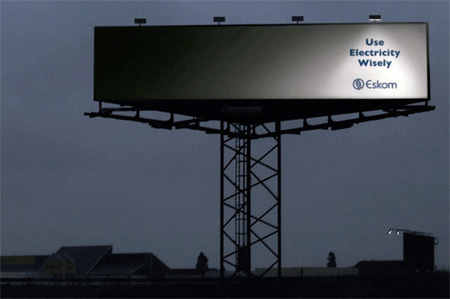
Eskom Electricity Advertisement
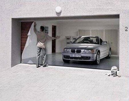
BMW Advertisement
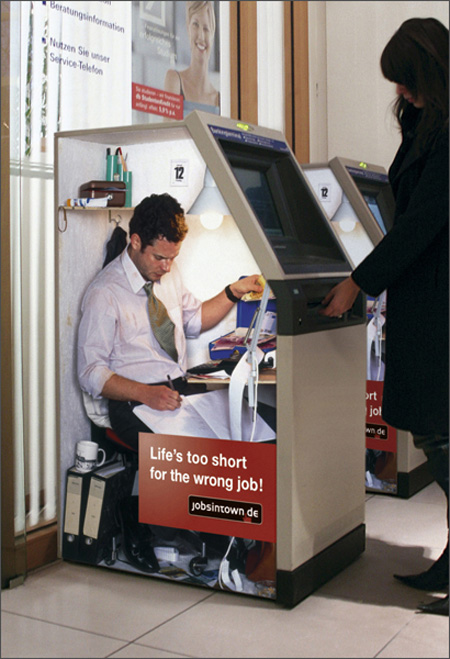
Jobsintown Advertisement
Creative advertisements for Jobsintown.de [more here]
Whiskas Origami Advertisement
Advertising Agency: TBWA London, UK.

Star Wars Movie Advertisement
Star Wars: Episode III – Revenge of the Sith.

Calcutta School of Music Advertisement

Rotkäppchen “Pacman” Advertisement
Advertising Agency: Cayenne, Germany.

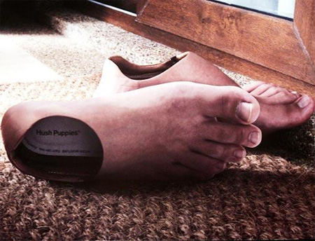
Hush Puppies Advertisement
Casual footwear for the entire family.
Denver Water Billboard
Use only what you need.

Related Posts
– 24 Unforgettable Advertisements
– 20 Brilliant Advertising Ideas
– Collection of Cool Coca-Cola Ads
– Collection of Cool Pepsi Ads
– 14 Creative Advertisements Part 1


Fred
Another awesome post! Thanks
Jun 4th, 2008
Ganis
haha… very funny, awesome…
i kinda like the fedex, it’s very brave..
Jun 5th, 2008
athie
ha……..
ha……..
ha,,,,,,,,
it’s so funny n’ can makes me smile,laugh and fun.
Jun 5th, 2008
rosita
Amazing,
thanks,
I really like “Calcutta School of Music” and “Formula Tooth care” ones
Jun 5th, 2008
Toys
Whoa, the feet advertisement is kind of creepy. The rest are very creative. We need more instead of the same old boring POS hip hop ads we see on tv.
Jun 5th, 2008
Amrboriro
Wery goods ouhh yeas thast cuul muahahahahah!
Jun 5th, 2008
Herzeleyd
Funny!!! hahahahah
Jun 5th, 2008
Bart
Very good! I already knew all of them becouse I had to do some researcg regarding the fenomenon: guerilla marketing!
very good way to advertise!
Jun 5th, 2008
business
Wow, these ads put all my marketing to shame. Thank you very much for this. Very inspirational.
Jun 5th, 2008
fais
creative and interesting at first glance… but most of them are very impractical when you think about it. I guarantee you advertisement companies are creative enough to have thought of these, but are also sensible enough to NOT go the route…
1) use what you need:
This billboard won’t catch your attention unless you are looking for it. Defeats the purpose of advertising when your audience will assume there is nothing there at first glance.
2)Formula tooth care:
Amazing, but the last thing you need is a billboard like that on a freeway or major intersection…given how many idiots drive on our streets, there will be accidents…
3)ipod
Just doesn’t make sense, im sorry it just doesnt…
4)Fedex
creative sure, but you know every marketing director at fedex or ups have thought of it,and if it weren’t for copywright laws you would have seen these 20/30 years ago…
5)Ironing service
good add, but i think to many of these “creative adds” could make your head explode…
6)Mr. Clean
Won’t work after 3 days. Actually will be rather detrimental… when u see that piece of road with his logo on it all nasty and grimey and black, the furthest thing from your mind will be “wow, mr. clean can clean!”
I could go on about the others, but don’t get me wrong, some of them are just brilliant (The electricity, jobsintown, calcutta music..)
I just had to post, because if you didn’t catch these business, then maybe just maybe its not these adds putting your marketing to shame, just your accumen?
Jun 5th, 2008
Kevin
& yet here we all are looking at them. How terribly un-brilliant of those advertising minds to create an ad that trancends the product being advertised & becomes something entirely different, garnering attention for the ad in a completely different medium. For free, no less.
Jun 5th, 2008
@fais
do you know anything about advertisements? i make ads for companies for a living and i know for a fact that those are brilliant and work effectively. shut up.
Jun 5th, 2008
John Thomas
Wow, advertisements, you have to love to hate them I guess. LOL
JT
Jun 5th, 2008
@fais
Each and every one of your critiques is trying their best to reach a conclusion that just isn’t there. You are trying way too hard and failing each time to present a sound and most importantly solid argument. Next time just look, smile, and admire something creative which you are obviously incapable of.
Jun 5th, 2008
glorf
I love how incredibly hostile you all are. Fais expressed a different opinion, and then you bashed her/him for…interrupting right of those advertisers to express themselves? Yes, the ads are neat and interesting, but he was right–some DO clash with Advertising 101. OH MY GOD IS THAT SO AWFUL? Jesus..
Jun 5th, 2008
Toxel.com
There is no need to call each other names.
Everyone can and should have different opinions.
note: some comments edited, some deleted.
Jun 5th, 2008
Biggy
thanks TOXEL.
as always the the voice of clarity.
FAIS
Just to help you understand the Nano concept, Its a tiny serve of popcorn. To go with your tiny Nano movies.
To my taste the best advertising requires the target audience to take a mental step.
Jun 5th, 2008
David Greiman
Nice collection! Thanks!
Jun 6th, 2008
Tony
i dont really understand the star wars one. is it just 3 lights that symbolize that its episode 3?
Jun 6th, 2008
iyiz
great pics, for adl lovers
Jun 6th, 2008
Антимаулнетизм
just amazing! thanks for the good ads
Jun 6th, 2008
@Tony
I’m assuming that it’s just a one of, in a bus shelter which has three lights like that already.
Jun 6th, 2008
Gregory
Can’t any of you people spell?
Jun 6th, 2008
guanodude
Awesome!
Jun 6th, 2008
Choiski
Those feet creep me out
Jun 6th, 2008
Cheap Leaflets
Brilliant inspiration!
Jun 6th, 2008
Василий
Прикольная реклама, есть чему поучиться! Спасибо за полдборку!
Jun 6th, 2008
fais
hahaha sorry about my previous comment! I tend to get over-critical so don’t mind me. :-P (my friends hate watching movies with me :-\)
I agree, good advertising should require the audience to take that mental step, but perhaps a few of these are too mentally tasking on your typical audience member?
I am not questioning the creativity of some of these ads. I do find it hard to believe, however, creative ideas similar to these have never been considered before especially given how much money is invested into the marketing industry. I find it easier to conclude rather why these types of ads aren’t prolific, maybe the greater minds behind marketing considered the IQ level of the average target consumer?
Regarding my terse (questionably sound) critical analysis, I was merely questioning the practicality of some of the previous ads. When I (someone who prides himself of being one with adequate foresight and perspicacity) find myself unable to comprehend the ipod nano ad (thank you Biggy for the explanation, haha it is rather ingenious), perhaps we shouldn’t critique these ads solely on their creativity and wittiness, but rather on their purpose: catch the attention of an audience large enough to attract enough customers to make the product profitably marketable?
And I don’t care what you say the Mr. Clean commercial is a bust! It is clever but very impractical – it wont last long enough to serve its purpose …at least give me that!
Jun 6th, 2008
Ian Cleasby (ZGambit)
I think the guys who made the ads deserve some credit lets face it some of the ideas that we see here can take some time to generate.
In the Advertising industry I see alot of hypocrites who don’t appreciate the ad for what is.. after all it is really art – Fais was one of them.
If you are going to analyze an Ad I really do believe you need to see the brief and the single minded proposition on what the Client and Agencies need to provide.
As far as I see all the Ads have chosen there media well and have created an creative idea to achieve awareness of the certain product.
Jun 6th, 2008
fais
btw thank you glorf. And yes ppl, it is very lonely atop my high horse…
Jun 6th, 2008
andrew
A lot of these appear to be fake, they look photoshopped. Take the UPS truck inside the Fed Ex truck, I have seen a lot of these ads circulating the net. When you think about it, that ad would only be effective from one angle. Any other angle and the image would appear skewed.
Not to mention, UPS has semi trucks of it’s own, so it’s not Fed Ex is doing one better through this advertisement.
Jun 6th, 2008
fais
@ andrew
very valid point. when you look at the jobsintown and follow the perspective to the focal point, it seems the jobsintown poster only works for the given camera angle. Which doesn’t make sense since the camera is at roughly the height of the ladies hand (approx 3 to 4 feet above the ground), versus something that would be more natural and work better (5 and a half to 6 feet)?
Jun 6th, 2008
beardo
To be honest, a few seem like they were taken out of some sort of photoshop meme like Photoshop Phriday in Something Awful, or Worth1000.com. More specifically, the FedEx one and the BMW one.
Besides that, let me defend the Mr. Clean one by stating that even if it does lose it’s superclean state, it will always look cleaner than the rest, no matter what, and the message comes across right anyway. As for the Toothcare ad causing accidents: don’t be ridiculous.
Jobsintown doens’t look like it only works from one angle, in fact, it looks like it works from every angle, since the photo is placed correctly, the mind forces the persepective right in the picture even though it’s not the ideal POV.
I do think the iPod Nano ad is way too selfreferential, and it kind of causes the opposite effect on me? Like, tiny popcorn for a tiny movie, instead of big popcorn for, sya, surround sound? I mean, not the best way of illustrating it, I guess?
Jun 6th, 2008
КРАЛЯ
СУПЕРР! ОТЛИЧНО, ПОНРАВИЛОСЬ.
Jun 7th, 2008
Jakeukalane
I like very much calcuta music school advertisment.
bye
Jun 7th, 2008
makus
I like very mauch . thank you!
Jun 7th, 2008
Ben
Creative ideas.
I like them.
Jun 7th, 2008
Yannis
Great collection. Very funny. Thanks!
Jun 7th, 2008
Mao
Klass! ^_^
Jun 7th, 2008
Tobbi
Really great ones =)
Jun 8th, 2008
blaze
” fais
btw thank you glorf. And yes ppl, it is very lonely atop my high horse… ”
shouldnt that be a shitland pony instead?
Jun 9th, 2008
blaze
btw,
marvellous advertising.
totally forgot to mention while reading your clever comments
Jun 9th, 2008
fais
@blaze
thats not a very high horse… :-|
and thats shetland… unless ur used to spewing shit everytime u talk, then i would see how u could misspronounce it…
Jun 10th, 2008
blaze
normally i dont, except when i provoke someone to have a good laugh or when your mother is involved.
naa that i didnt ment seriously, just like i said like the laugh of it..
so, or you gonna stop nagging or are you going to give me (another) dose of laughter?
Jun 10th, 2008
erengul
Just amazing! Wisefull.
Jun 14th, 2008
Alex C
Awesome collection! The electricity banner and Mr. Clean are bool-eyes!
Jun 15th, 2008
Jazhara7
The FedEx advertisement is real. It was done by the BBDO marketing company in Germany (located in Düsseldorf), and even won a RHINO award (2nd place):
http://www.rhino-award.com/voting2006/rhino06sieger.php
Click on the different images to see a larger picture of each. They’re all quite nice.
And even though I haven’t seen the FedEx advert on one of their trucks myself, they most likely did make the trucks like that. No, they wouldn’t get into trouble for that. Competitive advertising has been legalised in Germany back when I was in primary school (2nd grade, I think), which was, oh 14 years ago or so.
As for the perspective of the picture, yes, it only works from the angle the picture is taken from. But think about it: Its on a *truck*. 90% of the time a truck of that kind will be driving on the Autobahn, and the only people there seeing it will be people sitting in cars. In a car you’re sitting rather low, and if you’re right beside the truck, the last thing you will do is try looking up at the side of it. You’ll see the most of the truck while approaching it from the back, and usually a little to the left. Add to that the fact that, as I mentioned, you’re sitting at a low position compared to the truck, and you get pretty much the perspective that picture is taken from. In fact, if you look closely, you’ll see the image on the FedEx truck is taken a little from below, as you can see the ceiling on the picture. It’s brilliant!
I don’t know about the BMW advertisement. It is very similar to the style of the ads BMW commonly uses, at least here in Germany. Most likely it would be a print ad, so I wouldn’t have spotted it, since the only time I read the magazines they are in mostly is at the doctors.
I only understood the ipod ad after reading the text under “ipod nano”. It says “Movies in your pocket”. Still, I’d rather have a bit more popcorn. :P
The Star Wars Episode III add took me a second to understand: I think the neon lights are supposed to stand for light sabers. *OR* it’s supposed to be a big glowing Roman 3. As in “Episode III”. Or both. ;)
– :) :) :) :) :) :) :)
Jun 15th, 2008
Sansmind
Nice one, specially Eskom Electricity Advertisement
Jun 16th, 2008
paiobada
Star wars ad, pls describe it …. I don’t understand the meaning of this ad
Jun 20th, 2008
Enrico Foschi
Really amazing!
Thanks for this great post! Any way to subscribe to the site? Feedburner?
Jul 2nd, 2008
Toxel.com
To subscribe, just click on RSS button[top right]
or just go here:
http://feeds.feedburner.com/toxel
Jul 2nd, 2008
René Garcia, Jr.
I thought the hanging notes meant that Mozart and Bach sold drugs there. :)
René
http://www.workingauthor.com
Jul 6th, 2008
mahsa
hi, very funny and atractive,bye
Aug 5th, 2008
ryan
i just wanted to post to express my distaste in people like fais. why make things up when you’re sitting on the internet? competitive advertising laws allow you to use the brand name of other products you are in direct competition with. for christ sake, you’re sitting at a computer. do a little research before you open your mouth.
Aug 17th, 2008
the baldchemist
Years ago a toiletpaper company ran a campaign using a puppy running rampant through fields with rolls and rolls of toiletpaper.
Really cute ad. problem was no one remembered if it was Kleenex, Andrex,and e few other associated cometitors.
So one has to be careful with the creative.
The puppy became generic for toilet rolls generally not for the poor bastards who paid for it.
Most of the images on show here, and thank you for them, are more a branding exercise.
Thanks for the word keep ’em coming. The Baldchemist
Aug 18th, 2008
yogesh
Cool Ads
Oct 16th, 2008
Kevin Young
They just keep on getting better :)
Oct 27th, 2008
Future Wealth
It’s amazing. How could you collect those ads? Really superb. mind blowing
Nov 25th, 2008
myukaht
Просто отлично. С нетерпением ждем новых сообщений на эту тему :)
Jan 31st, 2009
Orre
Inspiring and GREAT
This is just extreme. I love realistic ads, just like FORMULA Toothcare. Do you think when someone bites a fastened canvas with the teeth, teeth will remain where they are? Bravo my dear!!!!!!
May 6th, 2009
May 6th, 2009
Chumpy
Lol. UPS just got its ass whupped by Fedex….
Love the ads. Keep posting!
P.S. the school of music ad is genius.
Oct 12th, 2009
Flare
Fais=Troll.
Can’t we just enjoy art? These are supposed to be creative works of art that people are entertained by. People getting entertained by the ads equals more income from consumers.
By the way, the material that the Mr.Clean tile is probably made from some sort of plastic so that it’s resistant to dirt and filth.
And at Fais: Even if you put a second comment to apologize, people can see that you’re still being a jerk under those nice words. Loosen up.
Dec 30th, 2009