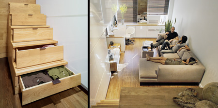
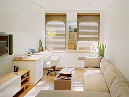
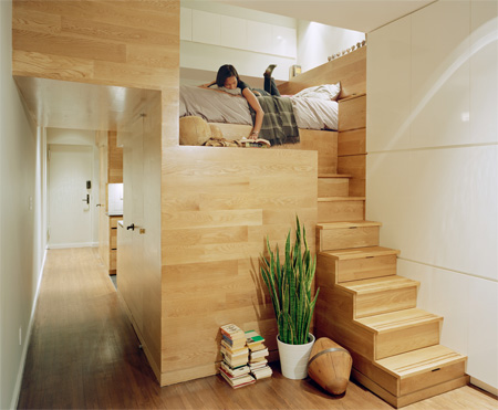
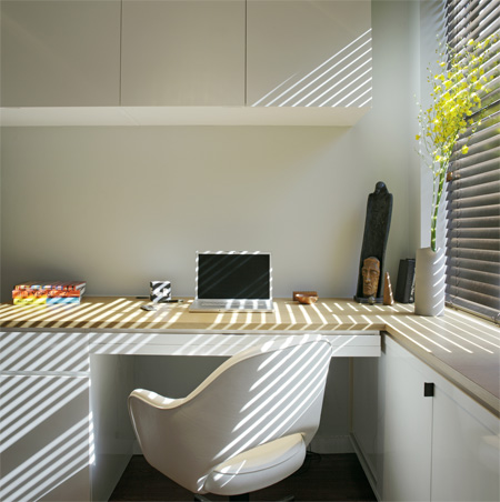
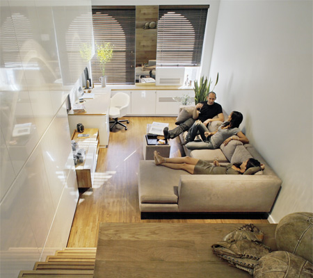
JPDA architects converted tiny 500 square foot apartment in New York into efficient living space that doubles as home office.
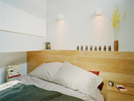
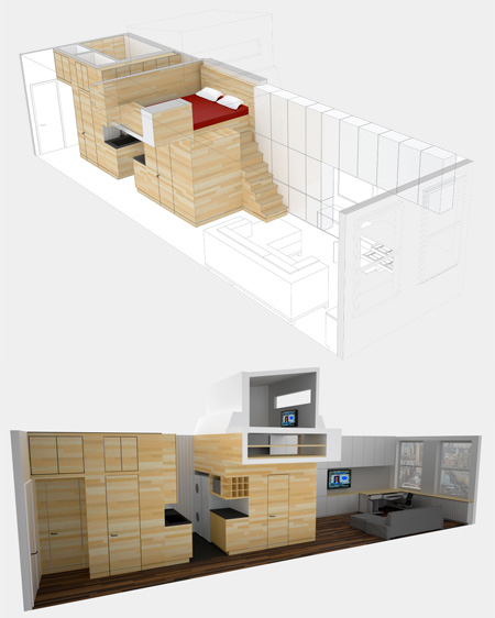
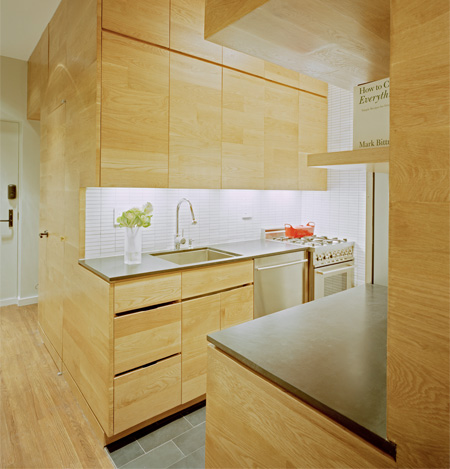
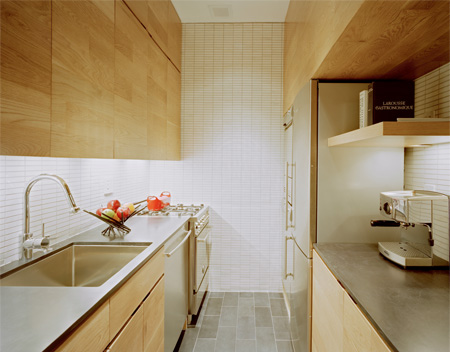
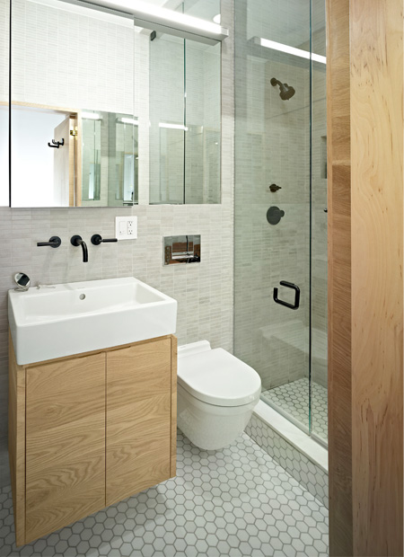
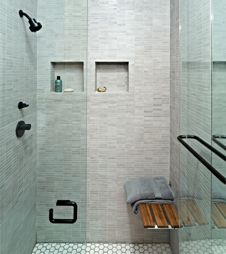
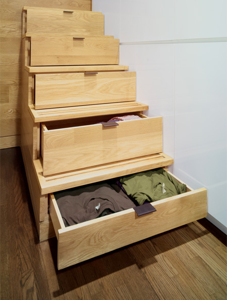
Unique apartment features intricately sculpted wooden core that contains new kitchen, small bathroom, integrated drawers, and comfortable bed.
For more inspiration, check out: Innovative Apartment in Hong Kong




Immelmann
Kinda nice, but I’d worry about the drawers being left open on the stairs. Seems like an easy way to break a foot.
Nov 15th, 2011
EugiKo
omg, so cool!!!!!
Nov 15th, 2011
Lilia Smiles
The house is very long….but I think the doorway should’ve opened up into the living room. That way the house seems bigger, so the kitchen and bedroom should swap sides with the living room.
Nov 16th, 2011
Andre
Inspiring! :)
Nov 16th, 2011
Sam
Lilia … yes but I think they were constrained by the location of windows.
Nov 16th, 2011
Maru
I like the concept but wouldn’t use too much wood in big pieces all over. It’s boring. If I live there I would be tired of the wood texture in a week!
Nov 16th, 2011
Lilia Smiles
Oh, thank you Sam! But this brings up another issue…poor ventilation. Wind won’t come in if it can’t go out!
Nov 16th, 2011
Sharyn
I think it’s a brilliant use of space. I prefer to have a bit more space – but it’s one of the few “efficient” living spaces I’ve seen that I think would be easy to actually live in rather than just somewhere to visit.
Nov 16th, 2011
craig
I wonder what the price tag is.
Nov 16th, 2011
Chad
Lilia, you really want the natural light from the windows to be in the living room/office, so the configuration they use is the right one.
Nov 16th, 2011
Angela
Seems commenters are missing the point….this was an existing space, likely in a very old NYC building. There is no way to change where the bones of the building (i.e., windows, entrances, etc) are. The point is the architect worked within thos constraints.
Nov 16th, 2011
Elliott
Nice place! 500 sq ft really isn’t that small for a studio. Heck, the 1bdrm I’m living in right now is only 700-ish. The steps scare me too, though! Stumbling around at night for the bathroom seems dangerous!
Also, those super hight ceilings sure didn’t hurt. They essentially added a second story!
Nov 16th, 2011
Marie-Axelle
Does anyone notice that there is no proper table in there?
not that practical I think
Nov 16th, 2011
Gert
I’d probably switch out the sectional for a single couch a small drop leaf 2 person dining table and have a couple of padded side parlor chairs for additional seating myself. That would open up the space a bit too.
This is not ideal for an artist and all their stuff but it would be just fine for the average person with minimal hobbies or who’s hobby is playing x-box etc.
Nov 16th, 2011
Darrell
I wanna live there.
Nov 16th, 2011
Princess
This is just so intense! Way too creative and a nice way to maximize your space. We own a condo unit with this dimension too but wouldn’t thought of having that spacious usage :)
Nov 16th, 2011
Kristina
That looks so awesome! I would definitely live there!
Nov 16th, 2011
tanpabeban
there shouldn’t be so much wood in the kitchen… i think the fire more hunger in this house….
Nov 20th, 2011