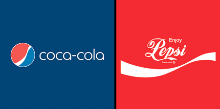
An ongoing project by Graham Smith shows us what would happen if popular companies decided to swap logos with their competitors.
Brand Reversions were inspired by Honest Logos and Simplified Logos.
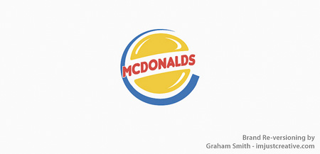
McDonalds and Burger King
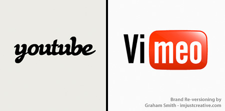
YouTube and Vimeo
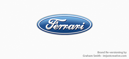
Ferrari and Ford
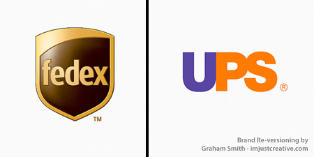
FedEx and UPS
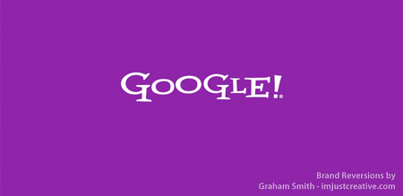
Google and Yahoo!
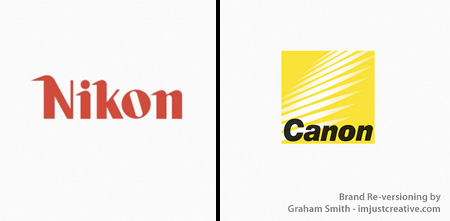
Nikon and Canon
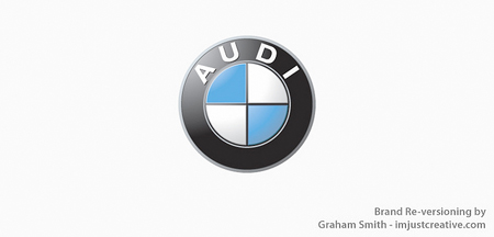
Audi and BMW
Visa and Mastercard
Netflix and Hulu
Reddit and Digg
Pizza Hut and Dominos
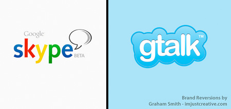
Skype and Google Talk
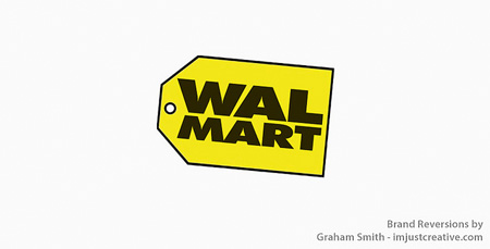
Best Buy and Walmart
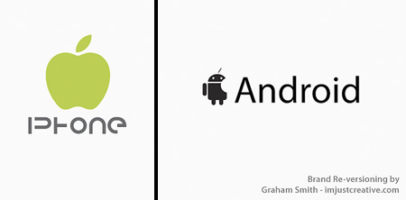
iPhone and Android
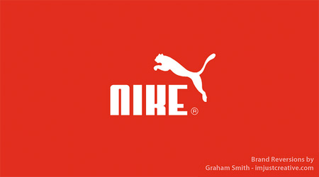
Nike and Puma
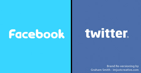
Facebook and Twitter
For more inspiration, check out: 24 Cool Logos with Hidden Symbols



woops
These all appear completely strange to me! Nice work.
Jul 26th, 2011
Ninja Egg :D
Nice job! Look great! Does anyone know what Vimeo is?
Jul 26th, 2011
Jules
Awesome! Nice idea!
Jul 26th, 2011
Jorge Vitor
Very nice! I love stuff like that.
@Ninja Egg :D :
Vimeo is a site like youtube, where you share videos, have channels, like the same thing. The main difference is that vimeo isn’t so mainstream/known as youtube (and that affects the content, in my opinion, in a good way). But go check it out, I think you’ll like.
Jul 26th, 2011
Ging
I’d still say it’s creativity at its best!
Jul 26th, 2011
Critical Eye
What is the artist trying to accomplish? Not sure I understand what the statement is. Visually interesting, though.
Jul 26th, 2011
J Rowl
I think the artist is trying to convey how a companies logo can be very powerful…even though they said something completely different all i could think of while looking at them was the original company, it didn’t make a difference what they said only what they looked like
Jul 27th, 2011
lili
i love all of these!
Jul 27th, 2011
Zach
@J Rowl
I agree completely. Well said. And to the artist, well done!
Jul 27th, 2011
Sharyn
Awesome!
I thought the swapped Coke/Pepsi both looked like cheap knockoffs done by a kid up the road. IMO it shows just how important choosing the right font is.
I also think the Nikon logo looks better in the Canon font!
Really couldn’t tell much difference in any of the others – I probably wouldn’t even recognise half of them as swapped logos
Jul 27th, 2011
kadal
it’s like watching a blue color but you insisted to say it was a red color.
Jul 27th, 2011
Christina
Coca-cola & Pepsi and Skype & Gtalk are nice. They worked, for me. :)
Jul 27th, 2011
Madame
I think it proves that you just see the shape and colour of the logo and don’t actually read the words.
Jul 27th, 2011
Betty
I can say for certain that if all these companies actually switched their logos, I would never/hardly notice.
Jul 27th, 2011
Dominic
These are awesome, so many mixed emotions about most of them…
Jul 27th, 2011
trolololol
these confuse me. lol. but they are great.
Jul 27th, 2011
cchana
Excellent post, in most cases the switch works well. For me, the McDonalds and youtube ones work so well I kinda wish that’s what they were!
Jul 27th, 2011
Steve
Very cool overhaul for sure. Sorry but I have to be “that guy”…. shouldn’t the android and iphone symbols be switched accordingly? Other than that pretty awesome.
Jul 27th, 2011
Aerwhyn
IMO, Twitter and Facebook look extremely similar whether swapped or un-swapped.
Jul 27th, 2011
Cheryl
For some of those logos, it didn’t make a difference at all (especially Nikon/Canon for me.)
Just goes to show that branding is about a lot more than a logo.
Jul 27th, 2011
dejan
Great idea not even one will complain:-))
Jul 27th, 2011
gjergji
I’m sorry, how’s this creative?! Take out Domino’s name and put Pizza Hut instead …wow.
However, for me the changed logos were a blurr — if I saw these on the street, I would not even notice the difference. It goes to show how branding can be everything and nothing at the same time.
Jul 27th, 2011
Andy
The problem is that UPS doesn’t have the arrow that FED-EX has in its logo(between the 2nd E and the X).
Jul 27th, 2011
Eric Muetterties
Funny how it can be hard to tell that they are different. Your brain knows something is wrong, but it wants to skip over that because you are so used to seeing the graphics.
Jul 27th, 2011
elaine
Identity is so vital to branding. Withouth branding/identity positive marketing would almost be impossible!!!
Jul 27th, 2011
Anonymous
lol @ Ford and ferrari…how can ford be even compared with ferrari :-s
Jul 27th, 2011
LPL2
It’s cool that, for some, the switch looked great on both (like Nikon and Cannon) and some, only one looked ok (MC came out better than Visa) I liked, but was kinda put off by, Google in the Yahoo style. Seemed too frantic or jittery or something.
Jul 27th, 2011
Garrett Fitzgerald
Sorry, but Diane Duane cornered the Apple-without-a-bite market back in High Wizardry. :-)
Jul 28th, 2011
RE88
I think this is a great representation of how strong of an impact branding has subliminally. Very cool.
Jul 28th, 2011
Kelly
Some of these really threw me off. It is amazing how strong some of the visual branding is here!
Jul 28th, 2011
Jane Jordan
These examples really show how we all ‘read’ logos. In the same way we read words as shapes we see logos as shapes, which is why the Coca Cola, Ford and Mastercard logos are still read as they are meant, even though the wording has changed.
JJ
Jul 29th, 2011
Heidi
The YouTube version of Vimeo actually works pretty well for them! Too bad it’s their competitor.
Jul 30th, 2011
kaolin
those hurt…so good. :)
Jul 30th, 2011
Sandeep
In the entire show, iPhone is the biggest looser
Jul 31st, 2011
Picard Adama Kenobi
Somehow, some of swaps, shows that the words mattered more than the logo (YouTube, Visa and Facebook)
Aug 3rd, 2011
Tushar
Wow, that can get a bit unsettling after a while. Like messing with a greater force that cares very much about logotypes.
Nicely done.
Aug 3rd, 2011
laura
fabulous. Now make fake websites for these brands with the swapped logos…and see what people’s reactions are!
Aug 3rd, 2011
Jason
It really illustrates the strength of brand and brand awareness.
Aug 5th, 2011
Juliee
They look better like this. :P
Aug 7th, 2011
Dan
It would have been better to swap Adidas and Puma, given that the two companies were founded in the same German town by two rival brothers!
Aug 7th, 2011
Sherry V
Aren’t you the clever ones? I loved it. MWAH.
Aug 7th, 2011
Bearos
Reminds me of the scientific experiments where you have to read a colour word (e.g. red, yellow, blue etc) but the word is printed in the wrong colour (e.g. blue printed yellow, green printed red etc). It says a lot about the power of advertising that a logo is now as well established mentally as a frequency of light! That said I love the concept and found them really interesting to see. Thanks to the artist.
Aug 8th, 2011
EngineerZ
Maybe they should take the McDonnell Douglas logo and replace the company name with “Boeing” Oh, wait a minute…. Never mind.
Aug 24th, 2011
jinnie
the sans-serif coca-cola font is sorta nice here, better than the slightly italicized version in the pepsi original. i never noticed how nice yahoo’s logo font was until they replaced it with ‘google’ here. although it doesnt look all that great in yahoo’s original logo for some reason. i guess it’s the juxtaposition of the letters in ‘yahoo’.
Sep 8th, 2011
woundedduck
from a consumer standpoint, it makes no difference.
Dec 27th, 2011