The most creative, innovative, memorable, and unique packaging designs.
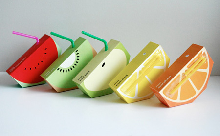
Juice Packaging
Creative “sliced fruit” juice packaging designed by Yunyeen Yong.
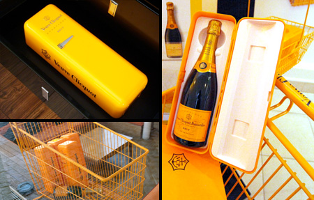
Champagne Mini Fridge Packaging
Veuve Clicquot champagne comes packaged in a mini fridge.
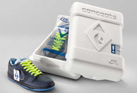
Nike Packaging
Unique packaging designed for Nike’s Blue Lobster Dunk sneakers.
Splitting Adam CD Packaging
Innovative and unique CD packaging designed for the band Splitting Adam.
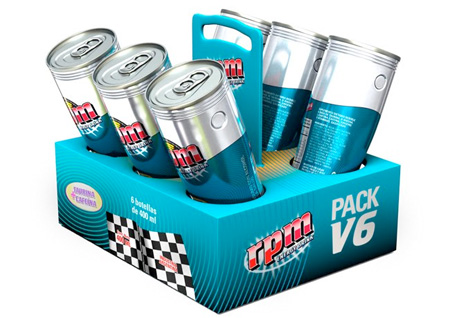
Energy Drink Packaging
RPM (revolutions per minute) energy drink inspired by car racing.
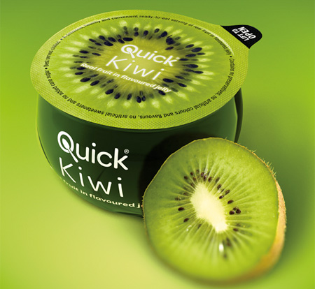
Jelly Packaging
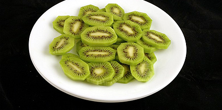
Awesome packaging designed to resemble sliced in half Kiwi.
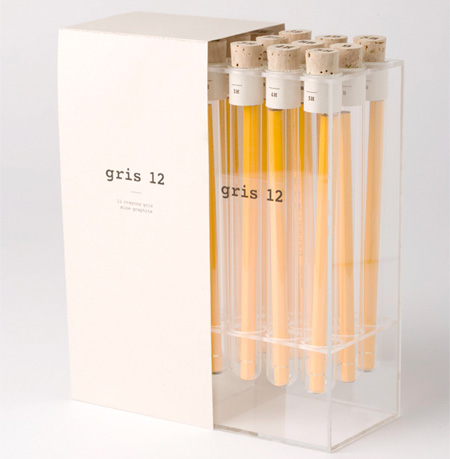
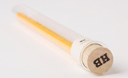
Pencil Packaging
Each pencil is contained in a glass cylinder topped with a cork.
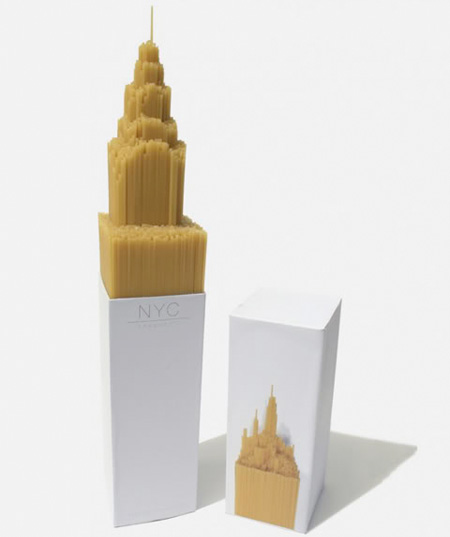
Spaghetti Packaging
Chrysler building inspired packaging designed by Alex Creamer.
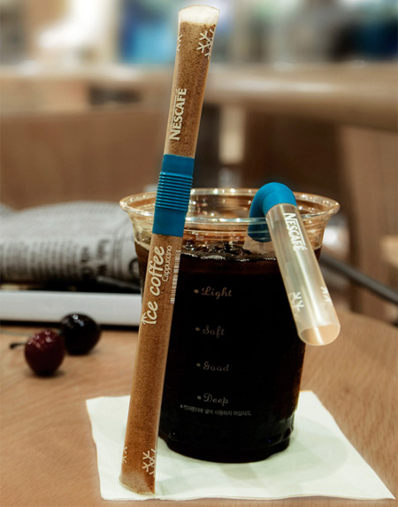
Coffee Mix Straw Packaging
Unique packaging serves as a straw for stirring and sipping coffee.
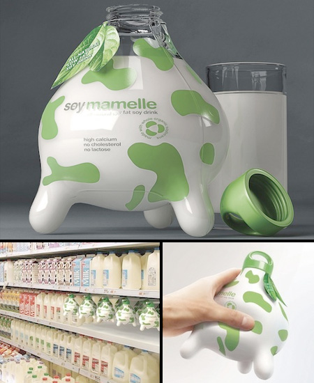
Milk Packaging
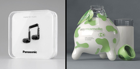
Udder shaped milk bottle designed to help consumers understand that soy milk is just as healthy as regular milk.
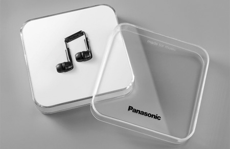
Headphones Packaging
Panasonic earphones were brilliantly packaged to look like a music note.
Also check out: Unusual and Creative Packaging Designs


cycarla
the coffee mix one is genius.
Dec 28th, 2010
Patrick
The music note headphones is pretty awesome
Dec 28th, 2010
old man
i love them ALL. :)
Dec 28th, 2010
JoAnn Hines
Creative packaging makes one product stand out from another on the shelf. That’s half the battle in getting the sale to get the consumer to take a closer look.
The packages are excellent examples of how unique and distinctive packaging can be.
Soymamelle is my favorite.
Dec 28th, 2010
Andrew
Love your postings…packaging post motivated me enough to comment. Great stuff. Keep them coming
Dec 28th, 2010
overhemden
The kiwi is great! haha…
Dec 28th, 2010
Van
this is classic toxel, i love all of them, especially the pencils
Dec 28th, 2010
mea
it’s so intelligently
Dec 28th, 2010
Fred
The soymilk, despite not coming from a cow, still isn’t right. Cows have four teats, three just makes it seem deformed…
Dec 28th, 2010
Dane
The coffee straw idea is kind of gross. I don’t know who touched the outside of the container, and I’m not sure if I want whatever they touched in my drink. Just saying.
On another note, my good friend Rob Heppler designed the Red and Blue Lobster dunks for Nike/Concepts and I still love that idea.
Dec 28th, 2010
Audrey
I wish I had fancy pencils..
Dec 28th, 2010
jaqi mugo
Not sure if I want to buy an udder for my milk, although it is kinda cute
Dec 29th, 2010
Hugo
coffee rules!
Dec 31st, 2010
x2fr
The pencil packaging is simply excessive, wasteful, and unnecessary. Using plastic, cork, and cardboard to package wooden pencils?! This is unique and creative but in a really bad way.
Jan 2nd, 2011
Jane
pretty much all of these are a complete waste. The only one that is useful is the coffee straw, however, I agree with Dane… Maybe if it were plastic wrapped… heh. Such a wasteful species we are.
Jan 7th, 2011
ugh
MOOOOOO
The milk one is verry creative
Jan 8th, 2011
Vinnie
I like that each of these is real. Too often you see concepts that wouldn’t work, these are realistic and still very creative.
Jan 20th, 2011
Dizzy Dee
Oh these are BRILLIANT!!!
Jan 25th, 2011
Mandar
because a whole kiwi is slow?
Feb 8th, 2011
Jurzy Du'velle
All of this stuff is sure creative and unique, but it’s FAR from practical. Unless the stuff packaged in those ornate displays is the best of the best, then you’re not going to have any luck trying to market them- people like inventory that’s well-shaped and the smaller the better to fit on various shelves. Thus far, the coffee/straw is the only thing relatively practical (and MAYBE the energy drink packaging, though it’s a maybe.)
So yes, it’s all very pretty, now fill the pretty cases with luxury-brand products to make ’em worth it.
Feb 27th, 2011
Elizabeth Stucki
These products all have excess packaging. I was dismayed at the sneakers packaged in styrofoam! And of course the pencils. Clever but very excessive!
May 20th, 2011
Kathyjog
I totally agree with Elizabeth. Cant designers be creative and use less packaging, too? And more recyclable matierials in minimized packaging. We need to use a much smaller proportion of our resources on things that get thrown away.
Jun 13th, 2011
Hisham Soliman
love the earphones and the spaghetti; all are great.
Nov 15th, 2011
courtz
love the poppers!
Jun 7th, 2012
Taylor May
Lovee the head phones !! Aghh I want them so bad.
Oct 17th, 2012