Clever uses of buildings in advertising campaigns by various companies.
Pantene Shampoo Building Ad
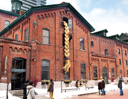
To demonstrate Pantene’s claim of “Really Strong Hair”, climbers climbed the oversized ponytails attached to a building in Toronto.
Anando Milk Building Advertisement
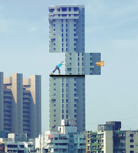
Considering that every child lives in a world of fantasy, the idea was to encourage kids to drink more milk by exaggerating the benefits of milk.
Allstate Building Advertisement
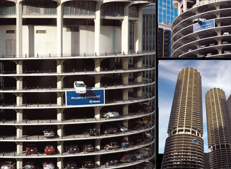
To promote Allstate auto insurance, an actual car was hanging on the edge of the parking garage in Marina Towers, a famous landmark in the center of downtown Chicago.
Axe Building Advertisement
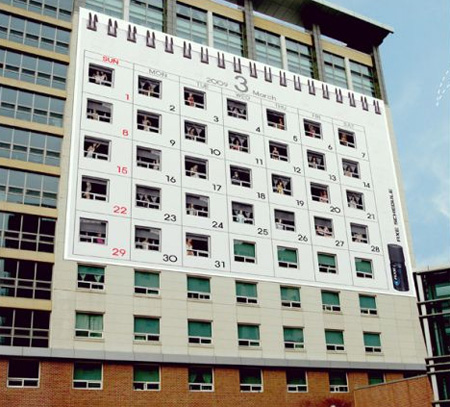
Female dormitory was decorated in the shape of a calendar to demonstrate that a new female can be met on a daily basis.
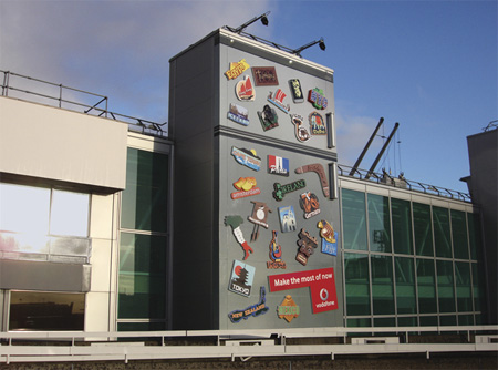
Vodafone Building Advertisement
BBH London has created this cool ad outside Heathrow Terminal 1. The ad fits in with Vodafone’s strategy of “Make the most of now”.
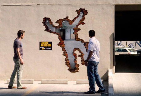
MBC ACTION TV Channel Building Ad
Stickers were placed on office buildings, giving the illusion of someone who has run through the wall to escape boredom.
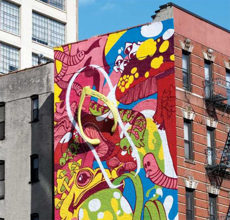
Havaianas Building Advertisement
Clever building advertising promoting Havaianas sandals in New York.
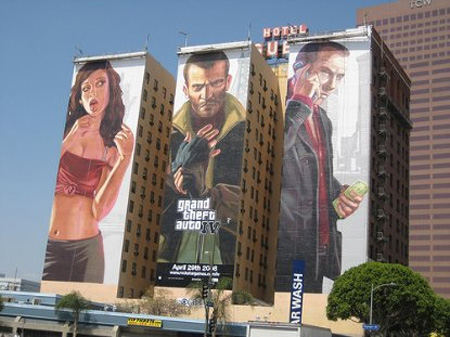
GTA IV Building Advertisement
Gigantic advertisement promoting Rockstar’s Grand Theft Auto IV.
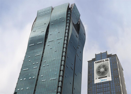
Powerful Fan Building Advertisement
Clever advertisement was placed behind Shanghai Haitong building to promote new powerful electric fan by Midea.
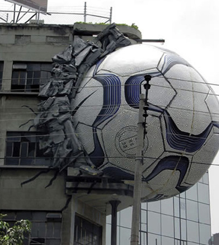
Nike Building Advertisement
Giant ball stuck on the side of a building promotes the World Cup.
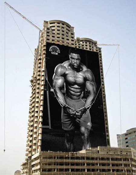
Powerhouse Gym Building Advertisement
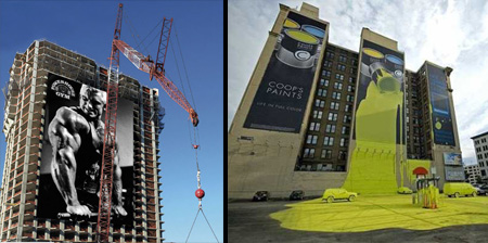
Creative advertisement campaign by Powerhouse Gym gives the impression that a body builder is lifting heavy weights from the construction site.
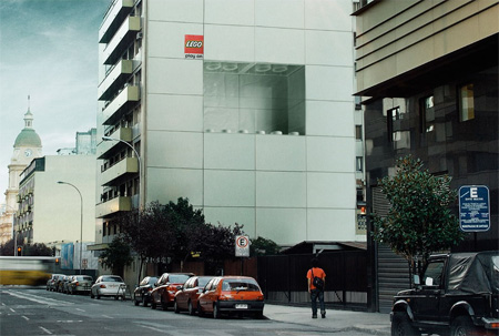
LEGO Building Advertisement
LEGO advertising in Chile made to match the panels of the building.
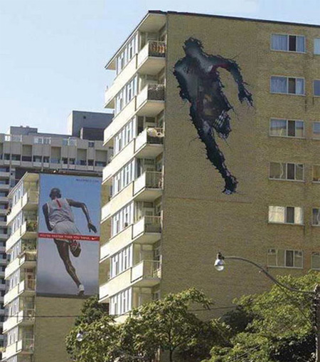
Nike Building Advertisement
The first building has a cracked image in the shape of the running man, the second building has the actual Nike ad, creating the illusion that the runner run through the first building.
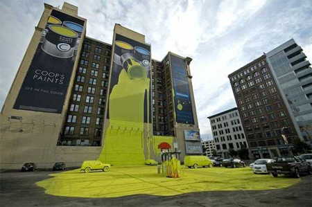
Coops Paint Building Advertisement
Yellow paint was dripping off the north side of the Atlas Building in downtown Columbus, Ohio promoting Coop’s paint.
Also check out: Examples of Creative Outdoor Advertising




Daniel Kurdoghlian
There are some very nice adverts there!
Especially the Powerhouse Gym advertisement is awesome!
Thanks for sharing those!
Nov 9th, 2009
Biiirdmaaan
Ummm, the paint one at the bottom is actually for Nationwide Insurance.
Nov 9th, 2009
Olivia
sidenote: Coops paint is actually a fictional company, the Advertisement is for Nationwide Insurance.
Nov 9th, 2009
Olivia
woops. beat me to it Biiirdmaaaan :)
Nov 9th, 2009
sean
being an advertising major, i think these are F**king awesome.
Nov 9th, 2009
Megan
Awesome creativity, love all of them!
Nov 9th, 2009
Manish Ahuja
MOST of them make you just stare at your screen and say WOW!!!
Nov 9th, 2009
Amber Sims Hinterplattner
Great posting with tons of brilliant examples of real guerrilla marketing! Thanks for sharing these creative outdoor advertising photos.
Yours Socially,
Amber
@AllStagesMktg
Nov 9th, 2009
BO$$
the gta one isnt that interesting. everything else is bo$$
Nov 9th, 2009
Yao Jia
Rapunzel, Rapunzel, let down your hair…Lolz…couldn’t help it ^^
Nov 9th, 2009
Paul Sample
Great collection!!!
Nov 10th, 2009
Moinid
Cool compilation of creative Ads
Nov 10th, 2009
Josh
These are pretty freaking cool. You have to wonder how long it took to put some of these up.
Nov 10th, 2009
Jaqi Mugo
These so rock!!!
Nov 10th, 2009
Karin Stewart
Some REALLY exciting use of building spaces for advertising, especially the building that are empty! Keep up the good work Ad Guys!
Nov 10th, 2009
Viktirka
Even good to stare these only in photos…how a precious brain to invent them!
Nov 10th, 2009
Amaneh
wonderful idea
Nov 11th, 2009
Astute
Advertising and Marketing students, please in the future don’t get caught up on what is “fu(k!ng awesome” versus what actually generates sales (your job).
Brand awareness for a fu(k!ng awesome ad fades faster than your tan in Siberia… you need to create a product experience after this exposure. Do not forget it!
Nov 11th, 2009
Azizuan Aziz
Some are funny
Some are cool
Nice collection anyway
Nov 11th, 2009
rehaz
brilliant
Nov 11th, 2009
Pedro Diaz
Amazing collection!
Nov 11th, 2009
hallowe'en flavr
HAIR NINJAS!!!!!!1!
Nov 11th, 2009
dp
Aren’t great clients awsome
Nov 12th, 2009
dp
they’re awesome too!!!!!
Nov 12th, 2009
cd/ad
A least half of these were not produced and were simply submitted as concepts. It would be nice to know the ad agency, at the very least, behind these.
Nov 14th, 2009
Josh Fryer
The ad from Columbus OH was awesome to see in real life. It was a lot bigger in person. Paint was EVERYWHERE in that parking lot!
Nov 15th, 2009
Stuart Flynn
Very inspirational!
Nov 20th, 2009
Sanda
like this……
Jan 16th, 2010
Lowongan
the best ads i’ve ever see
Feb 4th, 2010
Hemant
AMAZING COLLECTION…
Apr 2nd, 2010
SS.ness
These are outstanding! Bravo! I wish I had that level of creativity.
Apr 2nd, 2010
Chantelle
Awesome still think the last one is the best
Apr 9th, 2010
youngin`
i like the alstate one. and 2 of the nike ones i saw in real life. prety spectacular
Apr 26th, 2010
evlilik
Great collection!!!
Jul 9th, 2010
CAQ
influential. love this site
Jul 29th, 2010
ambika
wonderful ads… amazing creativity
inspired to c these ads
Jul 31st, 2010
Rebort
cool
Aug 24th, 2010
Suhail Ahmed
wonderful
Aug 24th, 2010
rain
i like it cool
Oct 29th, 2010
vISAn
All those r soooooooooooooooooooo creative. It makes us say a damn “WOW”
Nov 18th, 2010
Yosua
I need to spend couple minutes to staring at each advert… They r all fantastic!!!
Jan 24th, 2011
axcidburn
I love this creative idea and designs… thumbs up
Feb 25th, 2011
sana
anando milk and nike ads are wonderfull :)
May 4th, 2011
Micfr
Like the nike one. CREATIVITY
Jun 26th, 2011
Molly
The Axe one is awful, I’m surprised that the owner of building allowed it. I don’t think objectifying actual women, supposedly students, like that is socially acceptable.
Jul 25th, 2011
unknown
love the paint
Dec 21st, 2011
Just Jim
I used to work in the “painted building”. The picture brought back many memories.
Apr 21st, 2015